The Orange Taste – From blog to app: A fresh design for “The Orange Taste” food blog.
Project information
App Design · Concept Design · UI/UX · Photography
In 2020 (Blog and Photography 2014 to 2018)
Private Project
My Part – App Concept, Food Layout and Photography
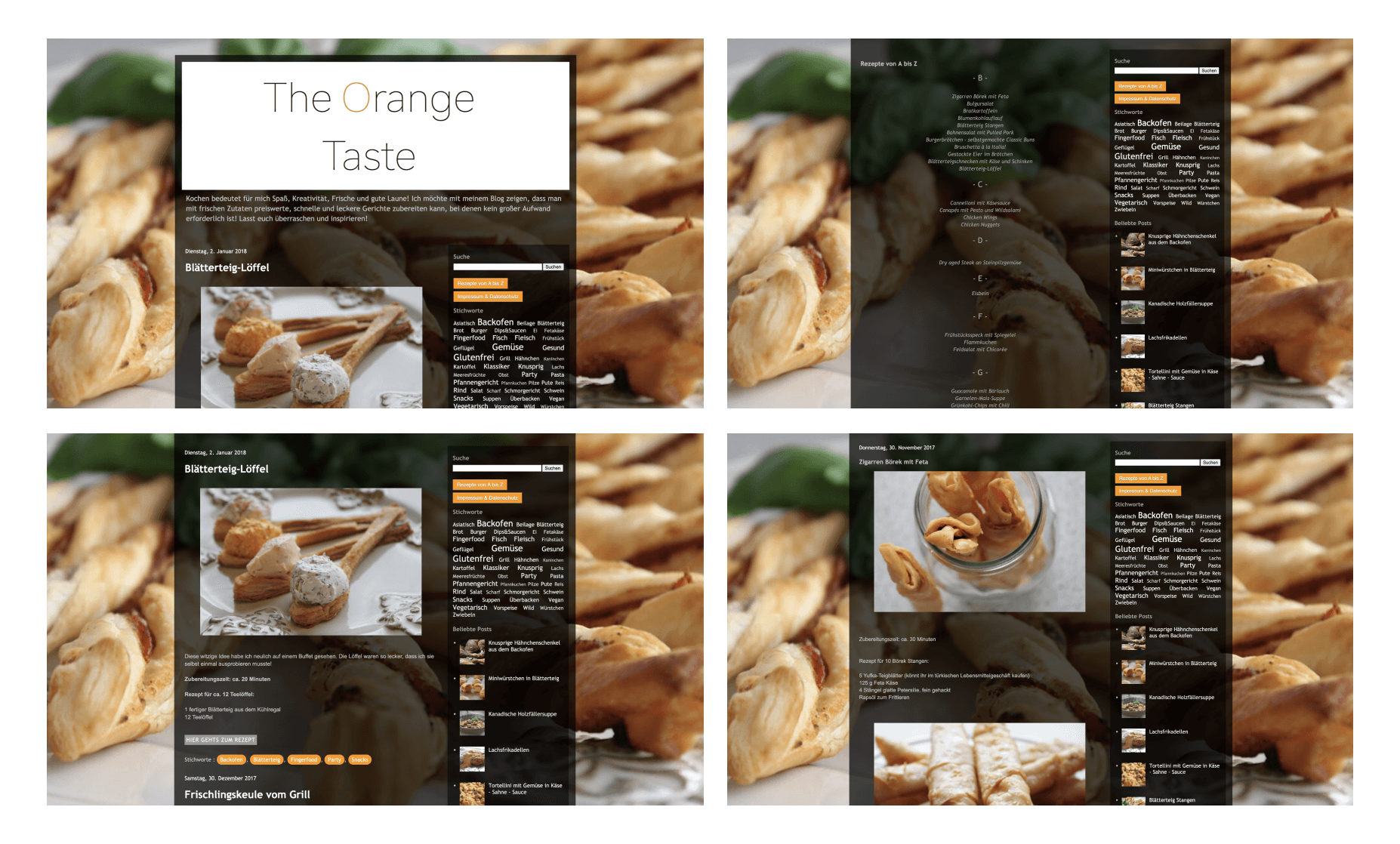
About “The Orange Taste” blog
For my mom cooking means fun, creativity, freshness and good humor! She wanted to show that you can prepare inexpensive, fast and delicious dishes with fresh ingredients, without a lot of effort!
This is how the idea of our cooking blog was born in 2016 as a cooperation between my mother and me.
The name was composed of my mother’s favorite color – orange and the most important part of the food – the good taste.
During my studies, I found it quite exciting to design an app concept for the blog (although the app has never been realized), because a lot of heart and soul was put into the blog at that time.
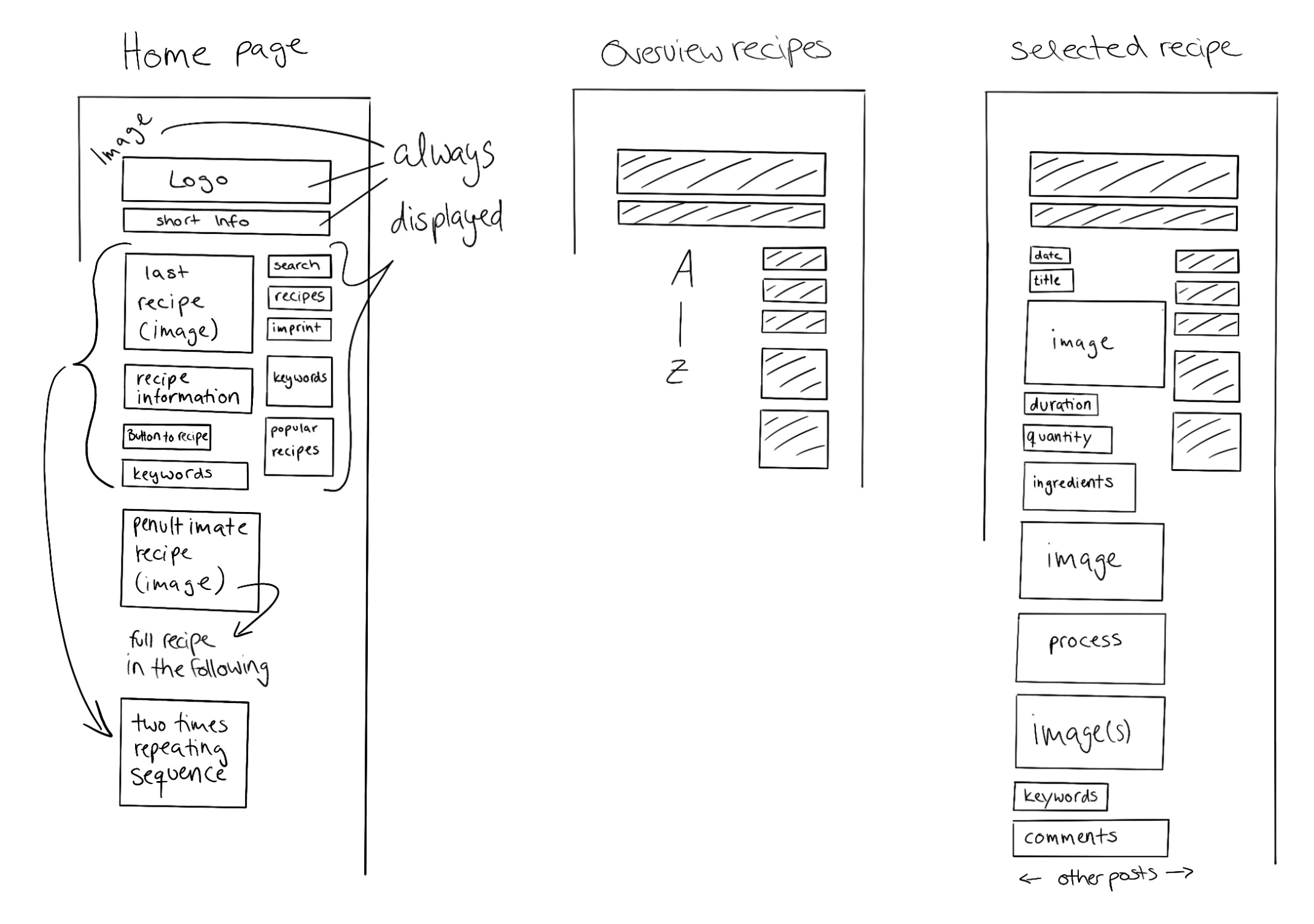
Blog analysis – Sketching
It was important for me to understand the structure and integration of the content in order to be able to transform it into an app structure.
The app design
As a basis for the app, I used the blog analysis. I wanted to retain the charm of the blog while making it more modern and cooler.
It was also important to me that as many elements of the blog as possible be incorporated into the app. I also wanted to emphasize the aspect of homemade kitchen. For this reason, many hand-drawn elements are involved. Supporting this, I have imagined a handwritten font in the headlines. Exemplary the fonts Kalam and Lato are shown here.
In the following you can see the User Flow on which the small animations are based on.
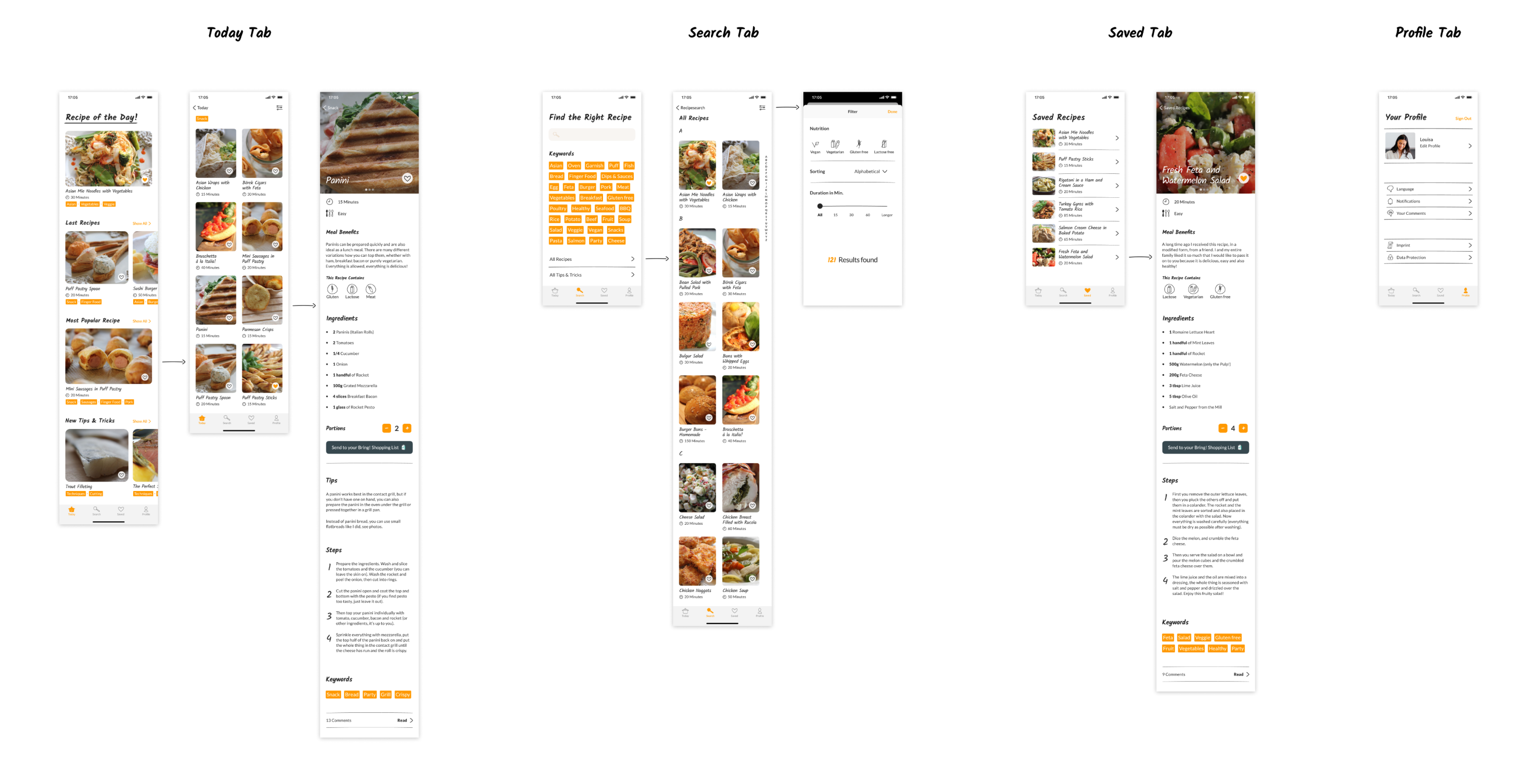
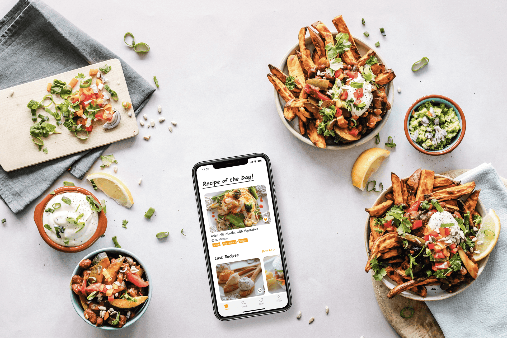
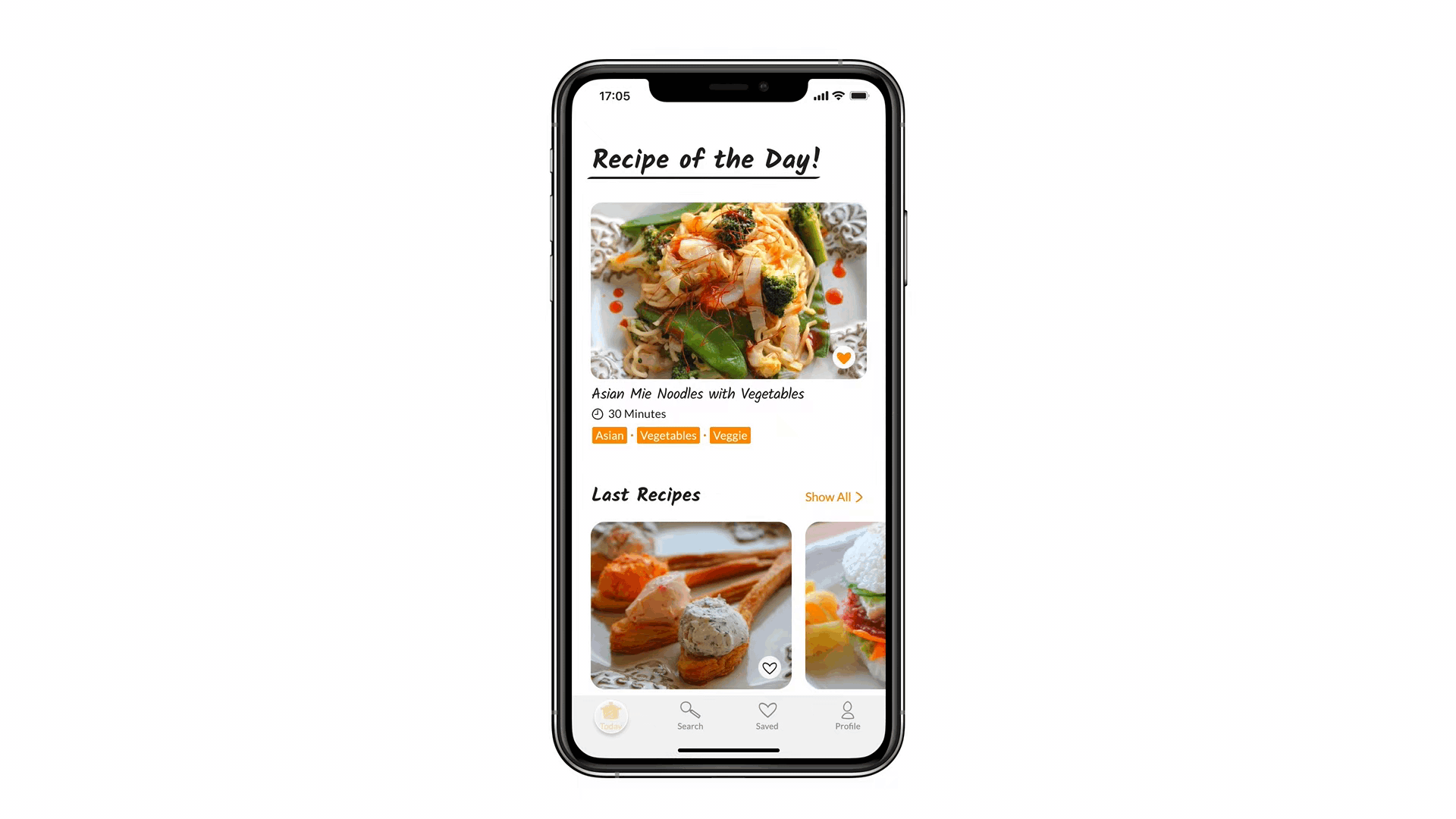
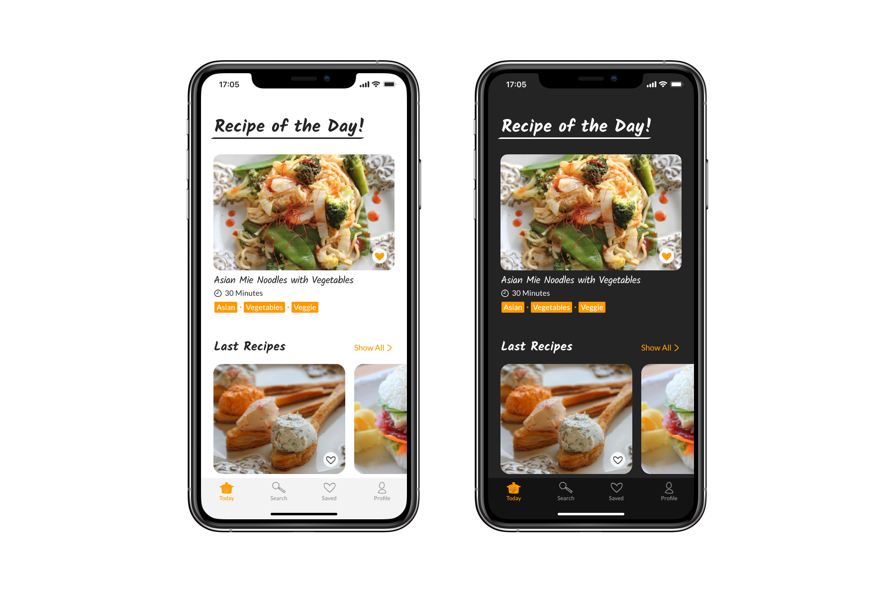
Today tab – Everything at a glance
The first tab is the today tab, where users can find the recipe of the day, the latest recipes, the most popular recipe, as well as Tips and Tricks.
Recipes can be liked via the heart and land directly on the saved list. Next to the title of the recipe and the duration, a selection of matching keywords is displayed, which can be used for interaction. If the users tap on these, they receive further recipes that contain the keyword. In the blog there was not yet the “Tips and Tricks” section, but we planned to implement this feature, for this reason I have integrated it into the app concept. In general, in the app there are clearer hierarchies and a better overview of the different recipes.
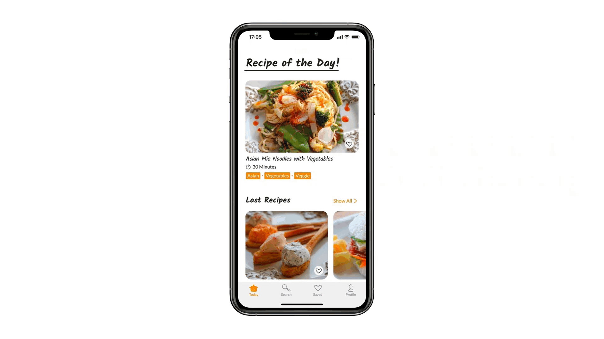
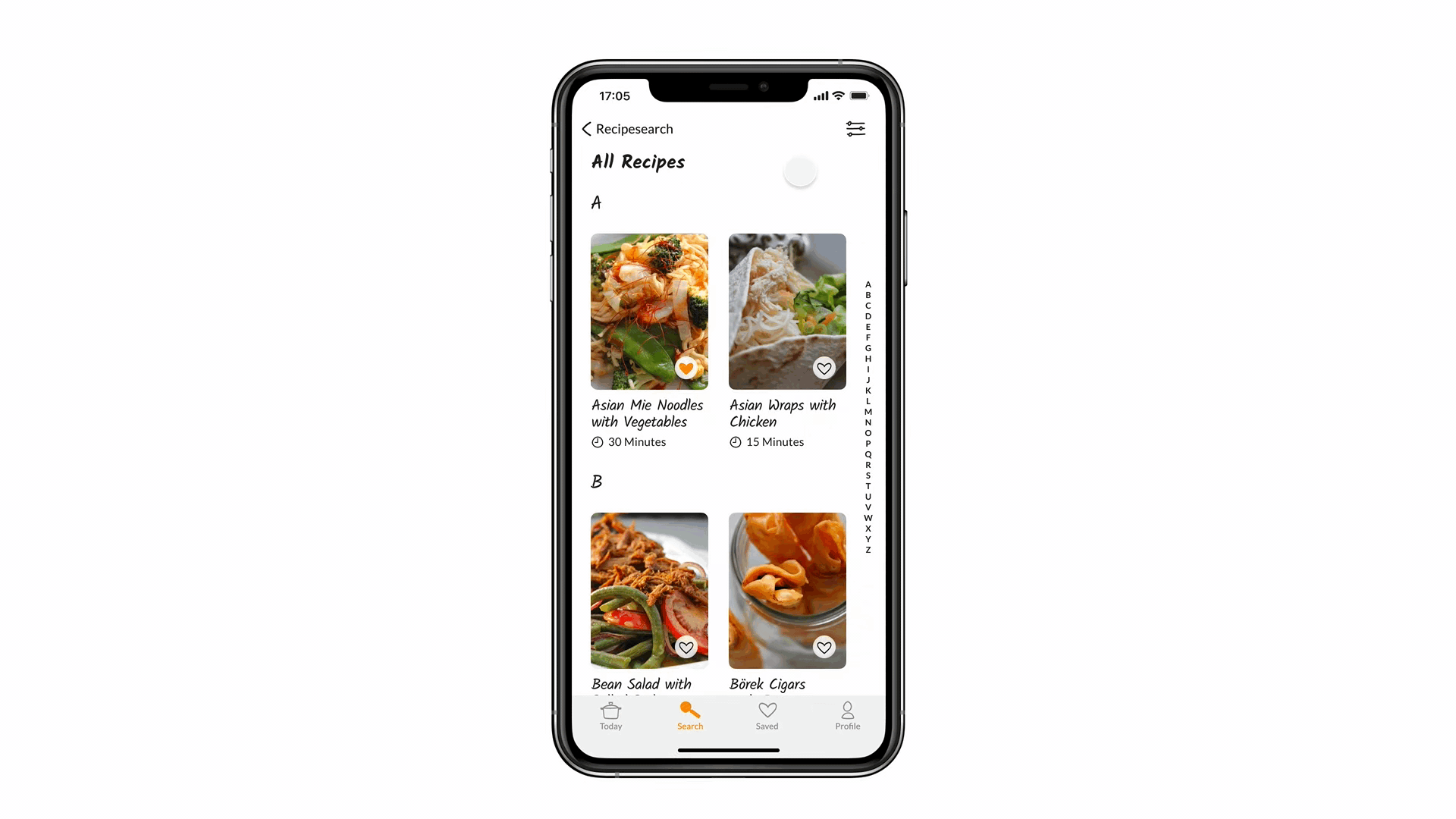
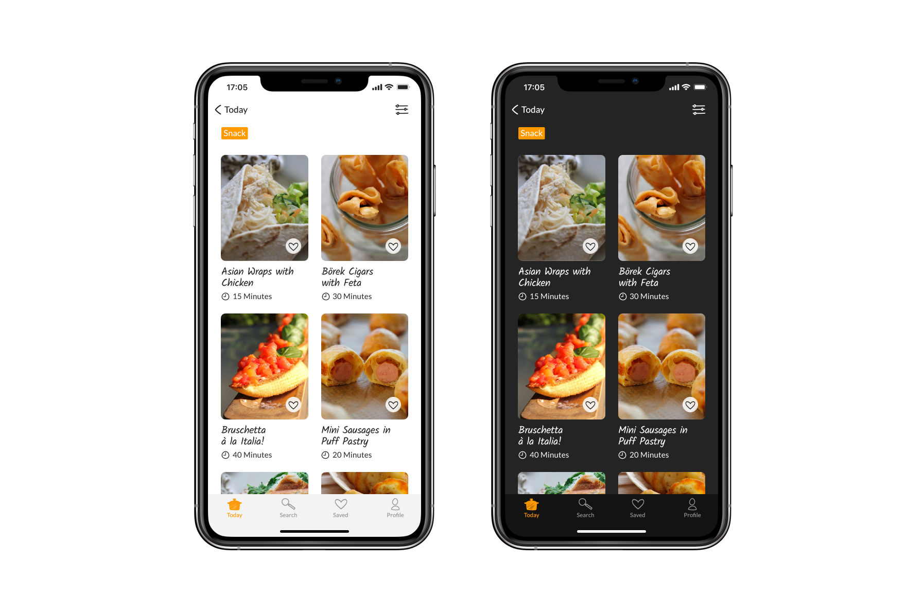
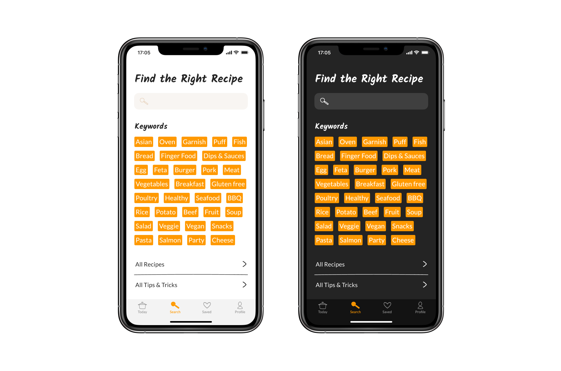
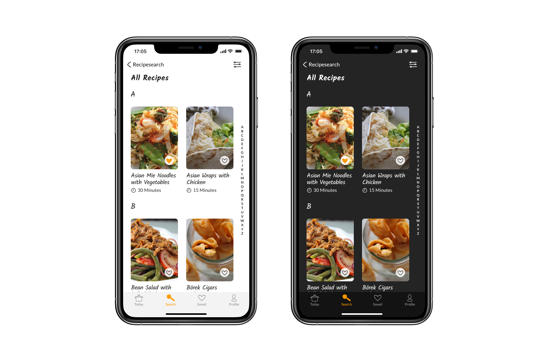
Search tab – Find the right recipe
The user has the possibility to find the right recipe via the search field, the keywords or the display of all recipes. Once this has been selected, the user is taken to an overview. The recipes can be filtered and you have the possibility to quickly get to the recipes with the respective initial letters via the letter display.
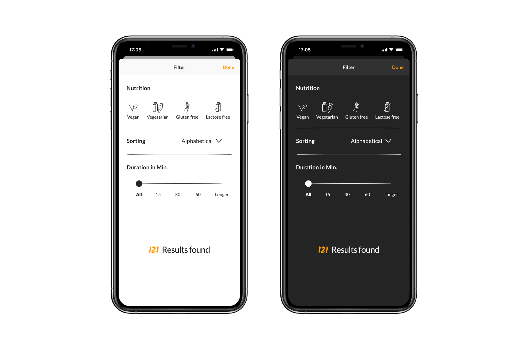
Filter – New compared to the website/blog
To enable the user to find recipes matching his nutrition or the required preparation time. At the bottom of the modal view, you can see how many results matching the settings have been found.
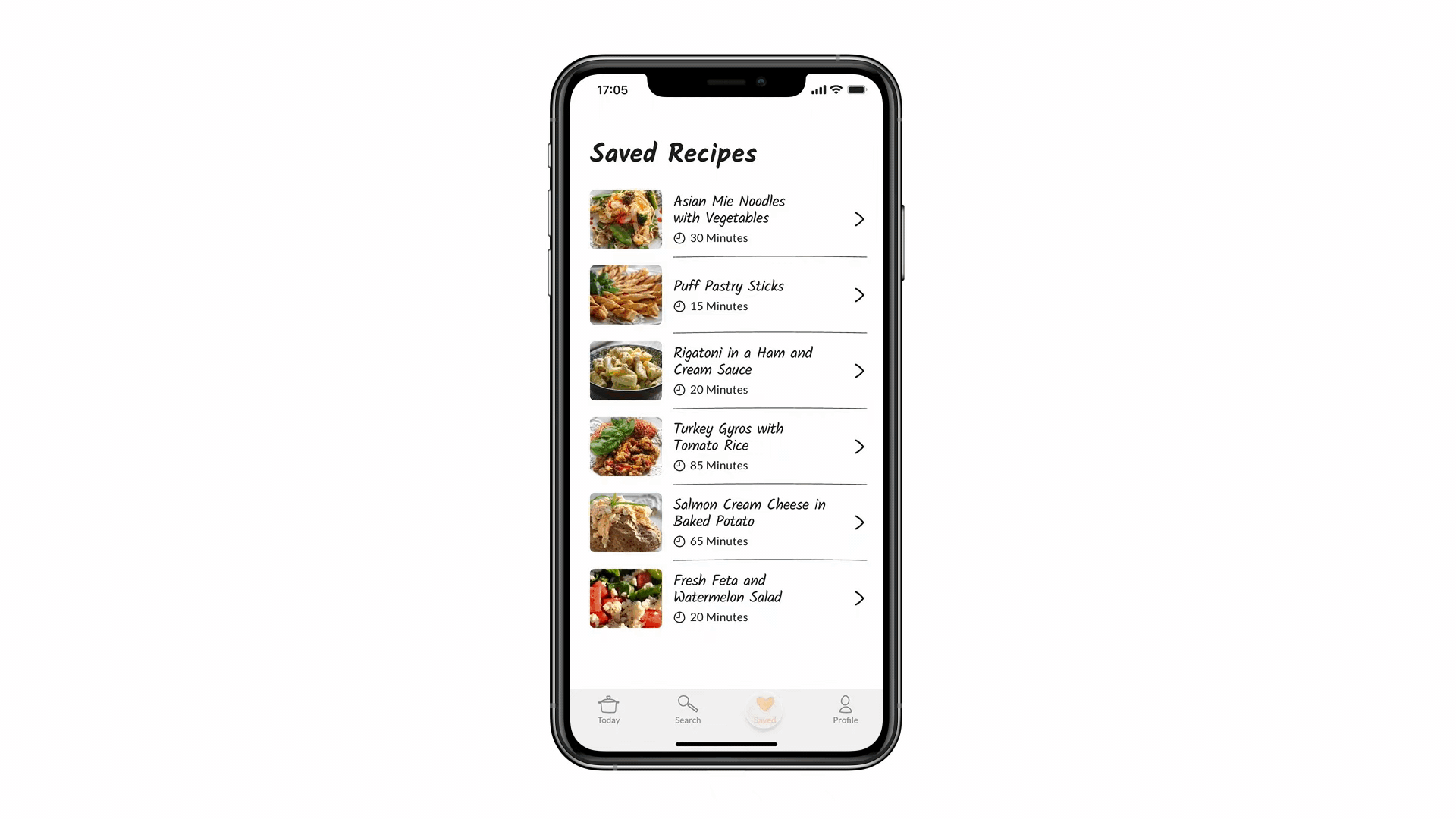
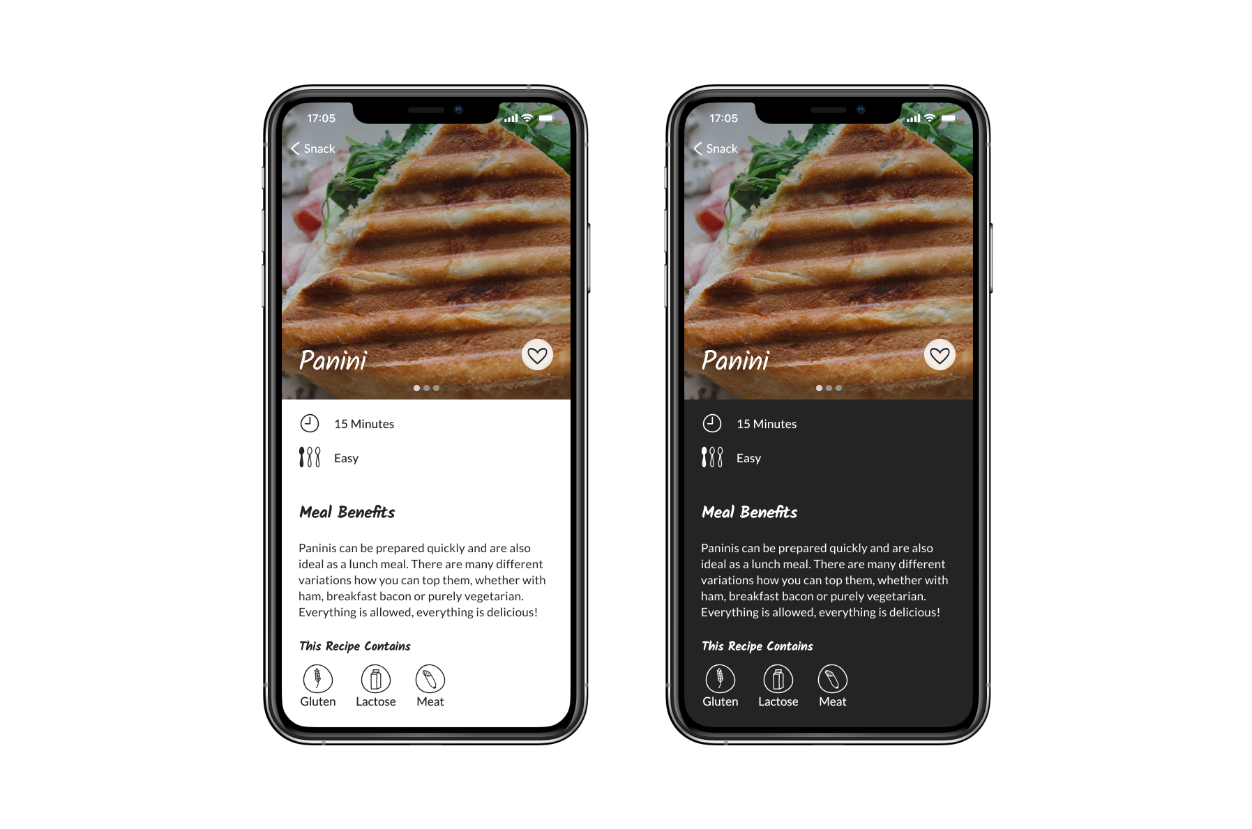
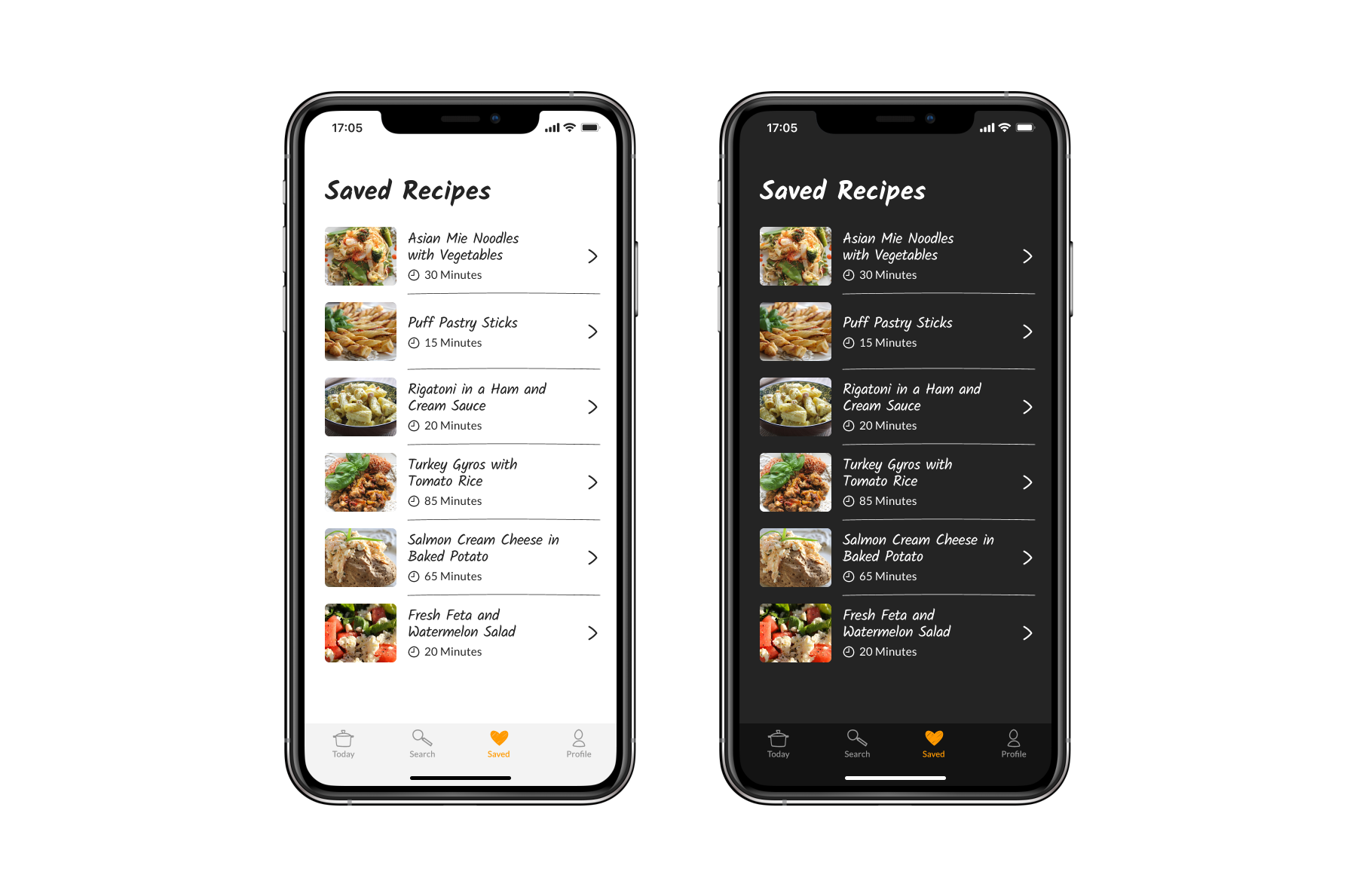
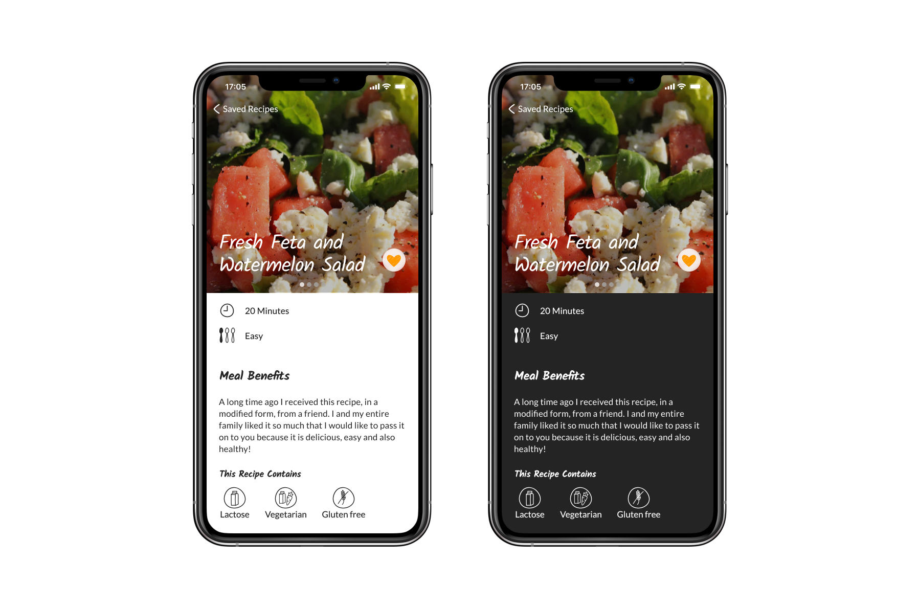
Saved – Quick access to your favorite recipes
Here are all the the users favorite recipes. The detail view of the recipe contains the duration, degree of difficulty, a short statement, contents, ingredients, suitable tips, the instructions, the keywords and the comment function. The tab bar is deliberately omitted, as the screen offers more space for the recipe. There is also a direct link to an existing shopping list app. In this case I choose the Bring app to ensure a faster saving of the ingredients for the selected recipe.
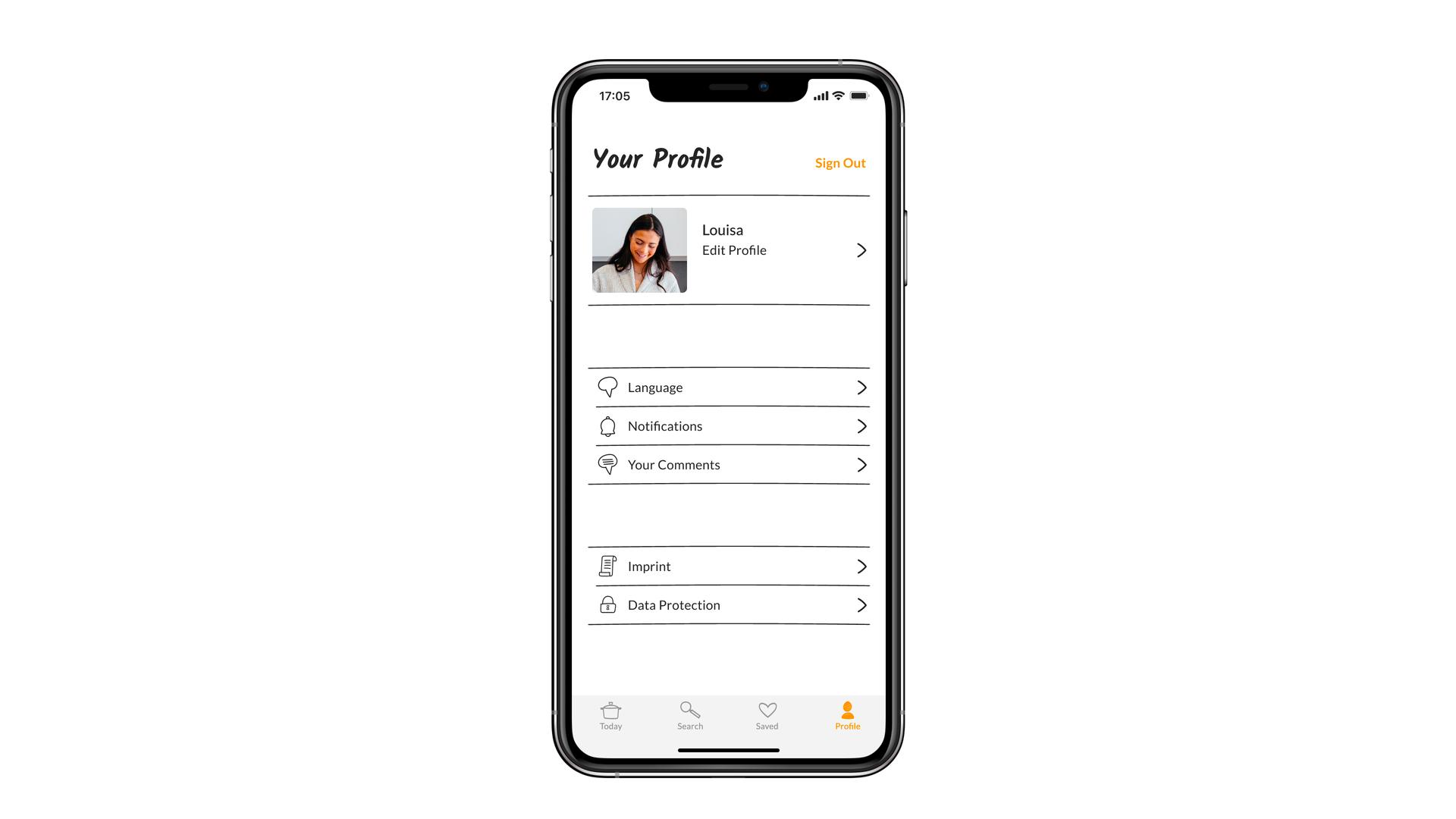
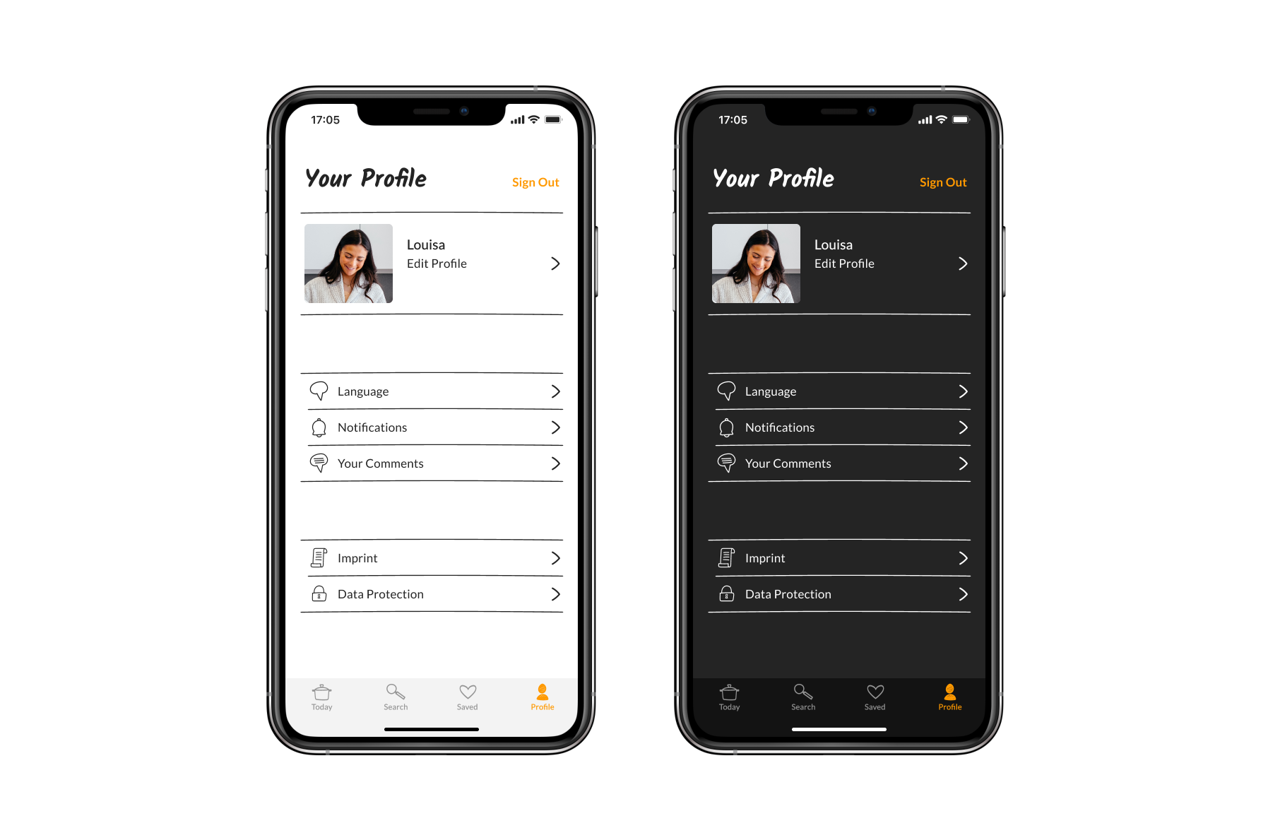
Profile – All settings for your Account
Here the user can customize personal data and the appropriate language, having access to notifications and his posted comments as well as written. The functions are supported by Icons provided in front.
Light vs. Dark Mode
As you can see in the screenshots of the blog above, white text is displayed on a dark background. Since iOS supports both dark mode and light mode, I wanted to offer users the flexibility to choose between the two.
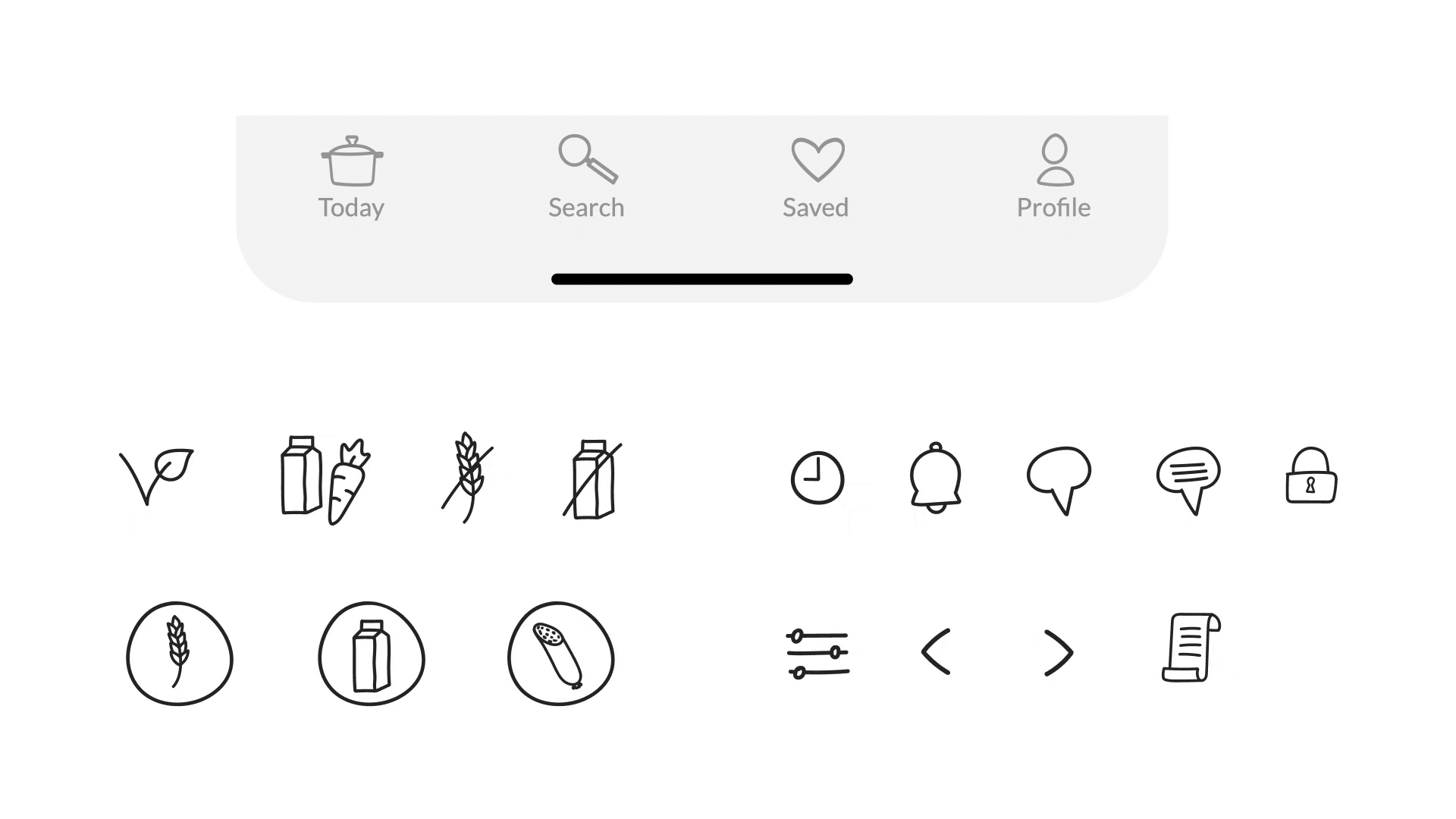
Icons – Hand drawn for the homemade character
To coordinate the Icons within the app, I drew them all by hand. So they create a coherent overall picture and support the effect of the homemade recipes. The aim is to convey a personal and private level that everyone can reach.
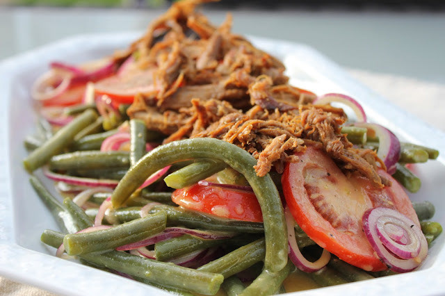
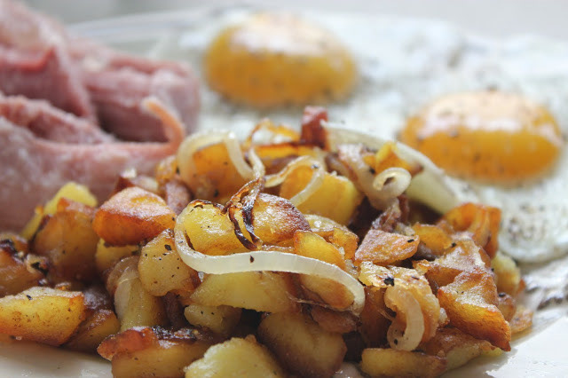
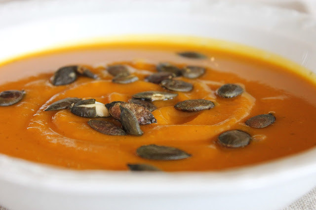
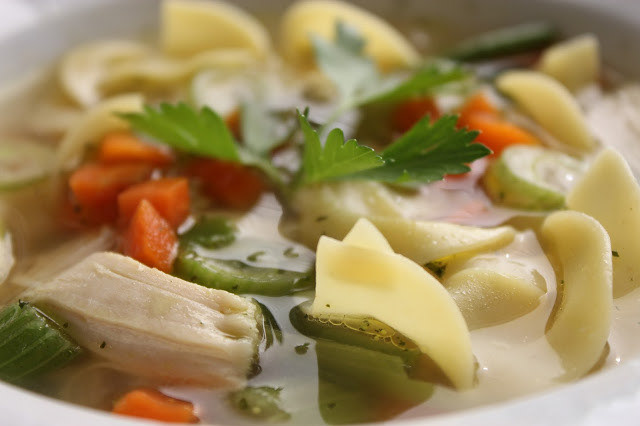
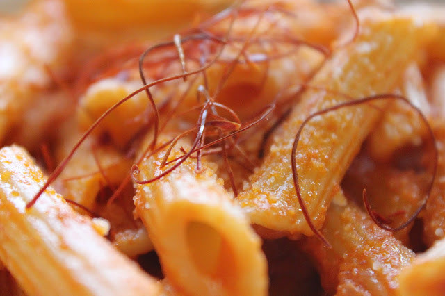
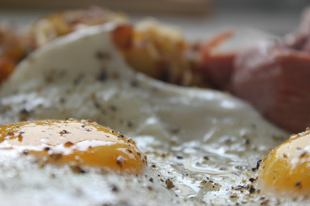
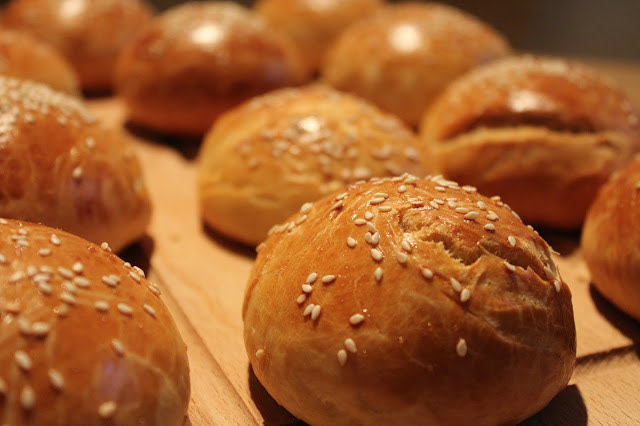
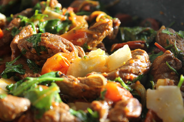
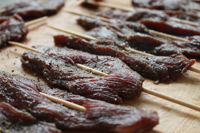
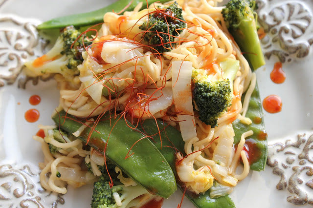
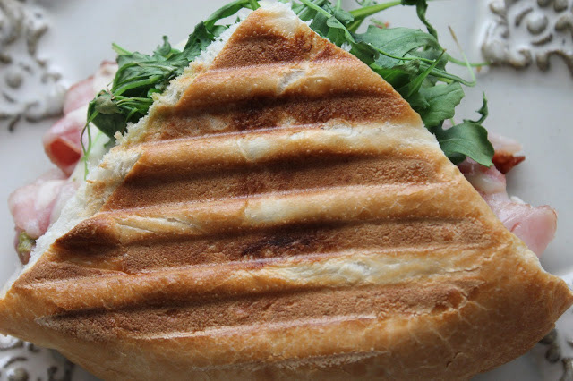
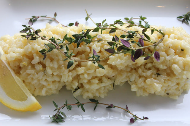
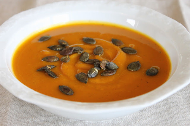
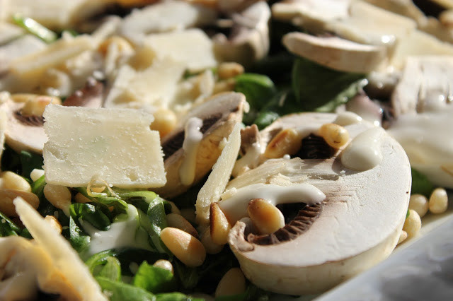
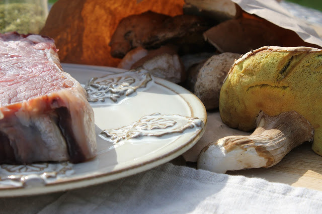
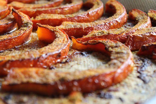
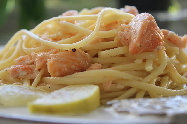
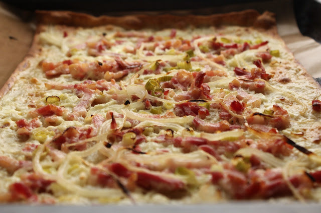
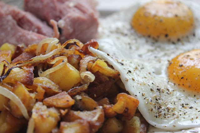
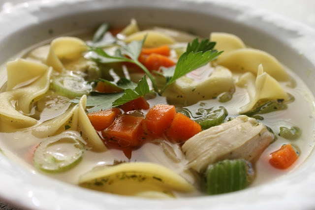
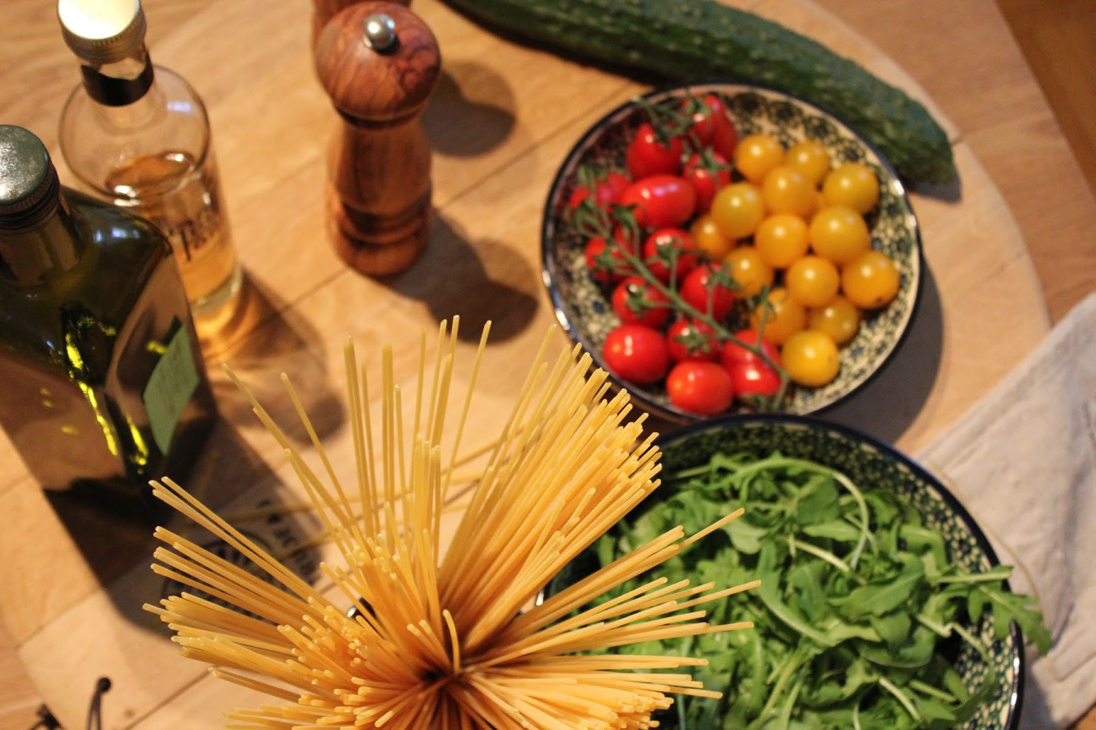
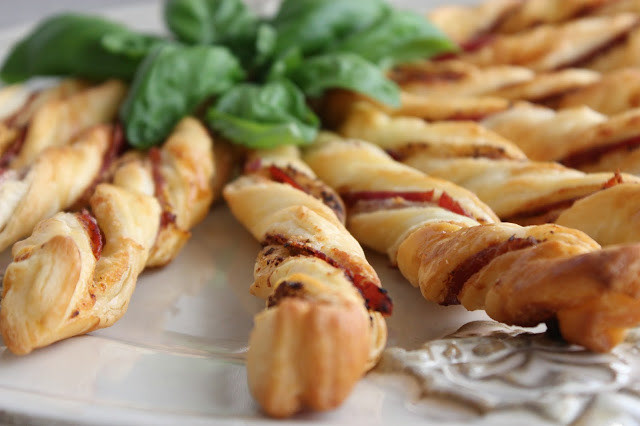
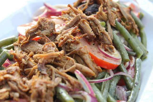
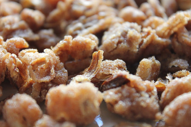
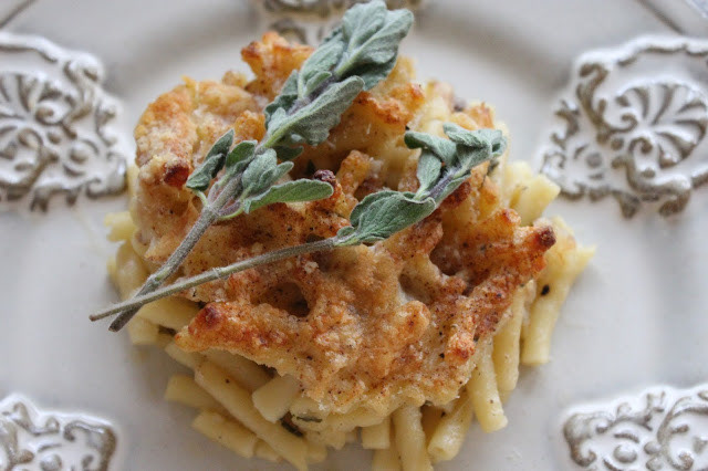
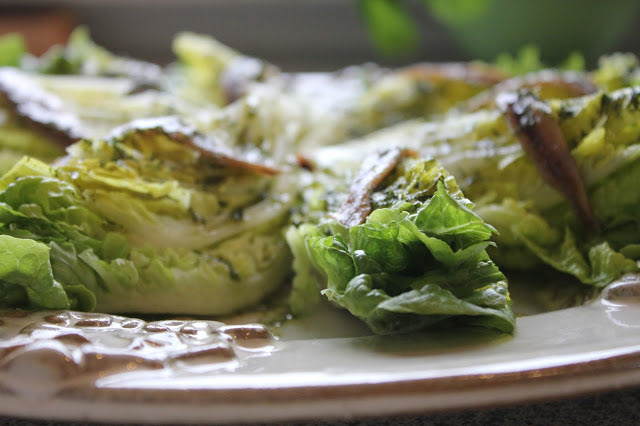
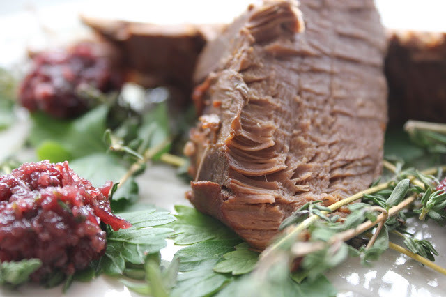
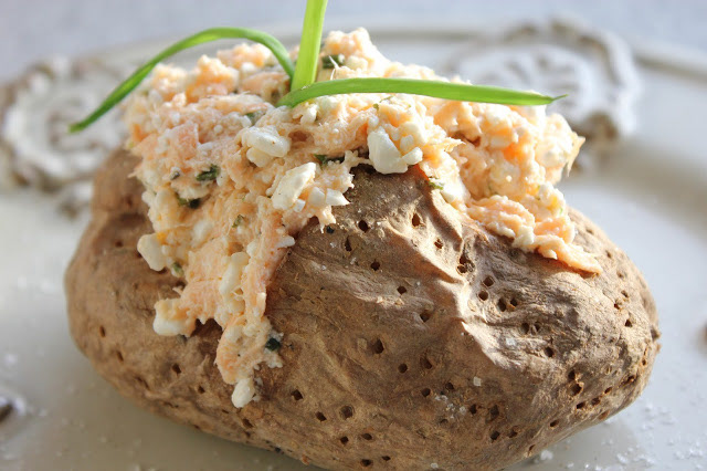
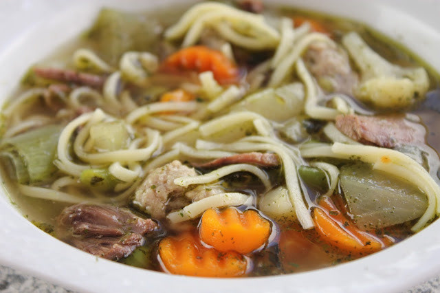
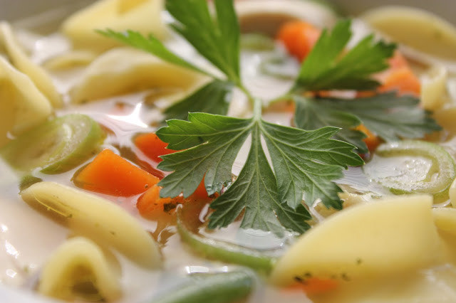
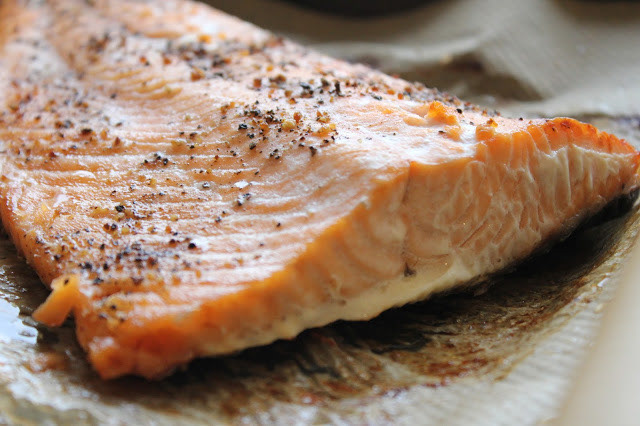
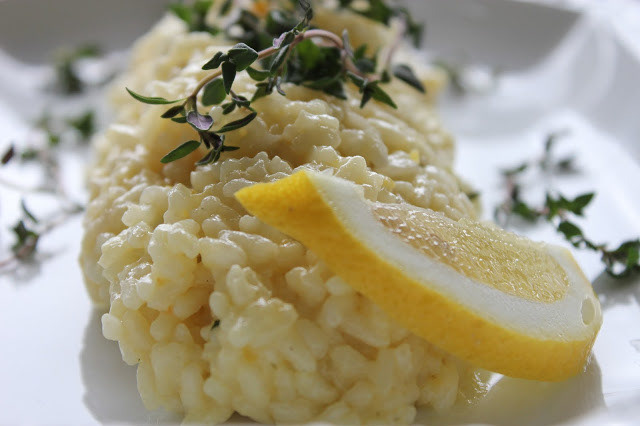
Food photography – Plate it, capture it, enjoy it
I had a lot of fun arranging and photographing the food it in all its facets. By the way, immediately after having been cooked and photographed the food was always eaten.
Look at a few attached photos to get a little insight. You can find more and the corresponding recipes on the website.