SharePlus – A car-sharing concept designed to meet the needs of people living in less central areas.
Project information
Car-Sharing · Mobility · Concept · UI/UX · Service Design
Winter 2022/23
Bachelor thesis under supervision of Prof. Dr. Frank Heidmann & Prof. Alexandra Martini
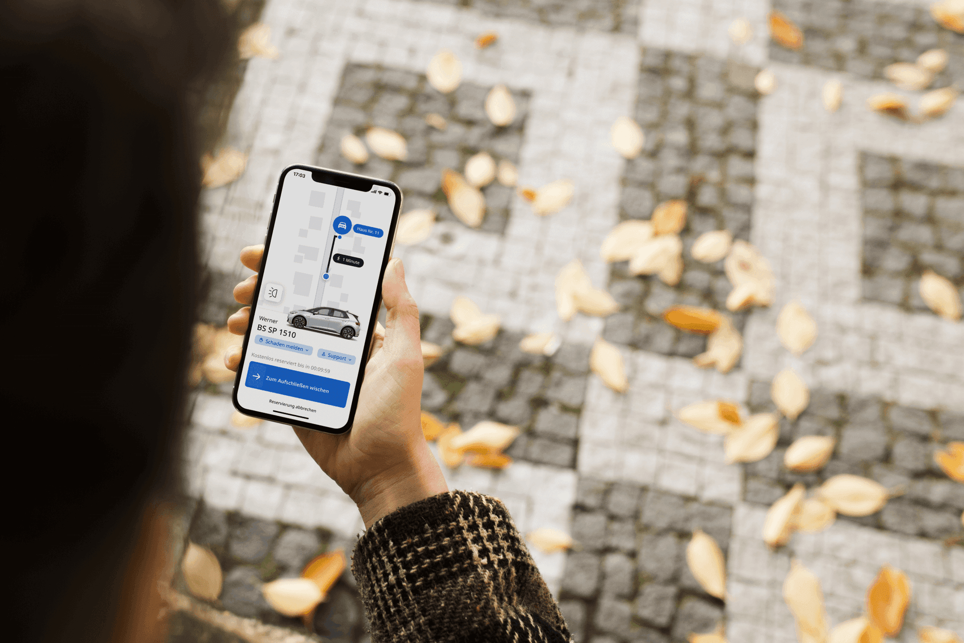
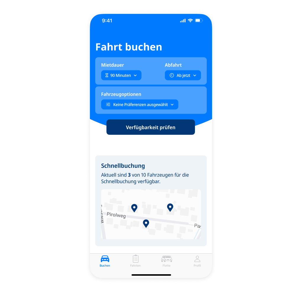
Sneak peak of the final screens
Why this topic?
I grew up in a small village and moved to Berlin for my studies, where I noticed a stark contrast: City centers offer nearly unlimited mobility thanks to public transport and numerous sharing providers, enabling flexibility without owning a car. In contrast, suburban and rural areas lack such options, with limited public transport and few car-sharing services.
Some car-sharing concepts exist for rural areas, but they remain largely unsuccessful due to limited availability compared to cities. Major providers avoid these regions, despite the higher need for cars.
This led to the main question of my bachelor thesis: Can a car-sharing concept be designed to better serve less central areas, reducing one’s own car dependency and promoting eco-friendly transport?
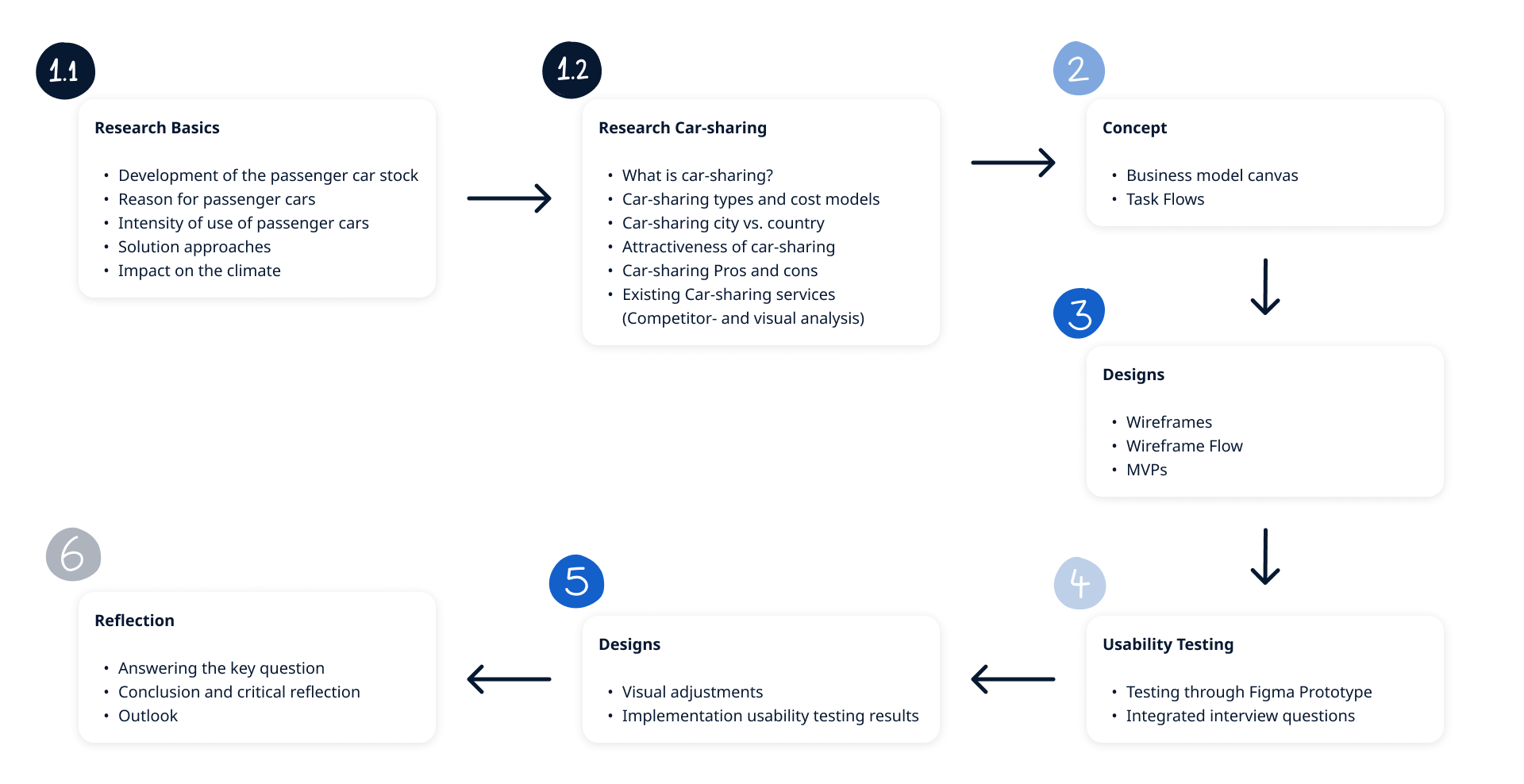
Overview – Process of concept development
After researching, I developed the concept, designed wireframes and screens, and tested them using an iPhone Figma prototype. Five participants (ages 20 to 60) from Dibbesdorf, a small village in northern Germany, provided feedback that shaped the final design. The process concluded with reflection.
Step 1 – Getting an overview (research stage)
My bachelor thesis is about 170 pages long. In order not to go beyond the scope, only excerpts are shown. 😉
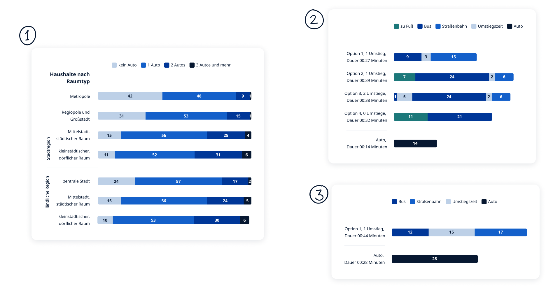
A small visual excerpt from the analyses that illustrates the importance of a car for people in peripheral areas:
1 – How many cars are owned by households according to area type (from Mobilität in Deutschland).
2 – Different public transport options to get from Dibbesdorf to the center of Braunschweig. Also the comparison with the car.
3 – The same route. Here is the comparison of the fastest route with public transport vs. car with delays/peak hours.
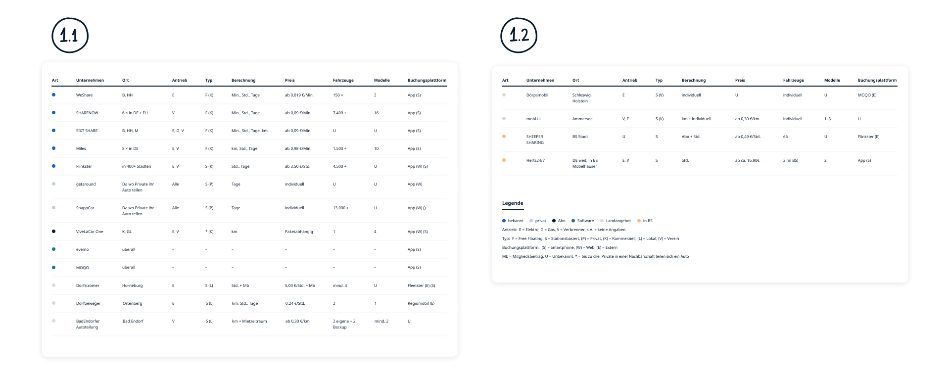
Content Competitor analysis to provide an overview and understanding of the different Car-Sharing models.
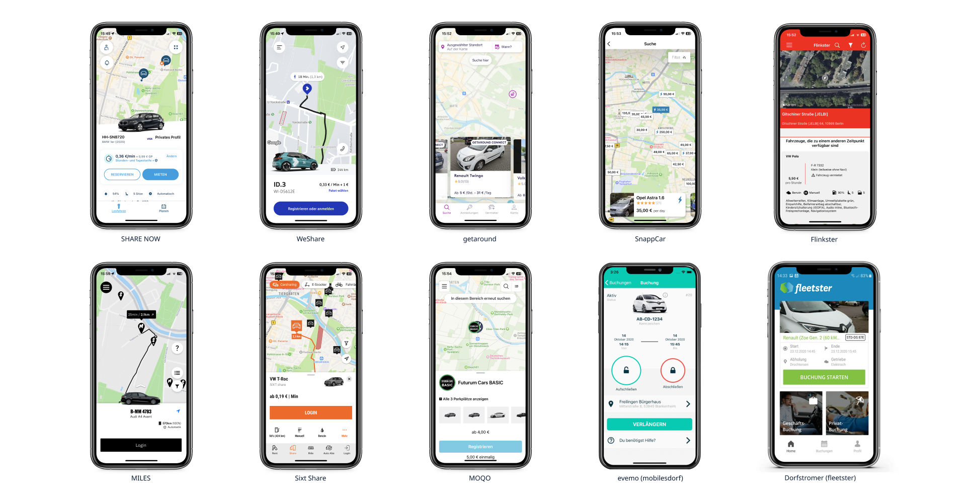
Visual analysis focusing on the appearance of each Car-Sharing provider’s app.
Step 2 – Developing the concept
First, let me explain the concept. Then I will show the methods used to get there.
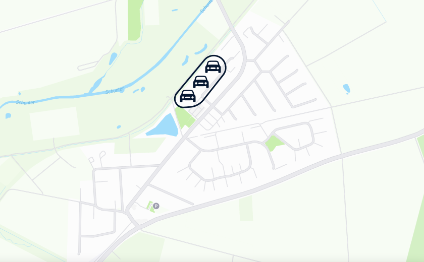
According to my research, conventional Car-Sharing providers in rural areas are always station-based. Station-based means that you pick up a car at a fixed station and return it there at the end of the rental period. Station-based has a disadvantage: here in the example of Dibbesdorf, you can see that the station is only easily accessible on foot from the surrounding households, most of the people living in Dibbesdorf cannot easily reach it.
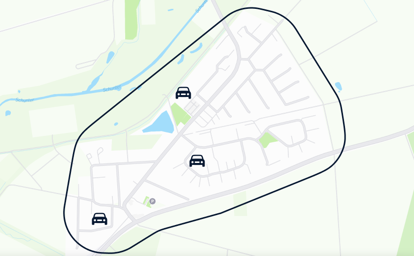
Then there is free-floating, which is mainly offered in large cities. With free-floating, there is a defined zone where cars can be parked freely. Transferring this model to Dibbesdorf in a simplified way. Namely, the number of cars compared to the population density, then compared to a large city, many fewer cars would be distributed over a much larger radius. The cars would again be so far away from many people on foot that only a very small proportion of them would be able to use them effectively. In addition, you never know where the car will be parked next.
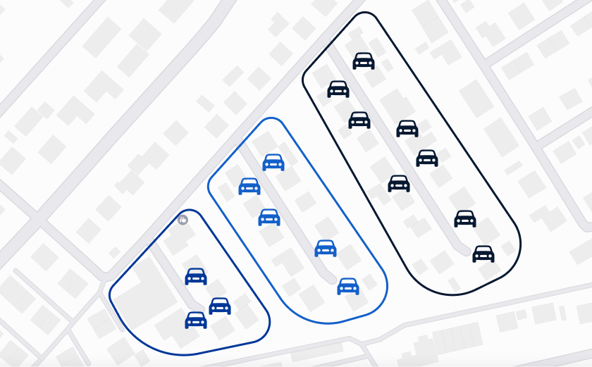
So the question is: what makes SharePlus different? The concept combines free-floating and station-based approaches. Residents of each street share a dedicated fleet, making the street itself the “station”. Within the street, cars can be parked freely, blending flexibility with a localized sharing model.
In short: the needs and usage data of households on a street are collected, evaluated, and aggregated to determine how many and which types of vehicles are required. Based on this analysis, the appropriate vehicle models and numbers are made available on the street, ready to be booked through the app.
Used Methods to get there:
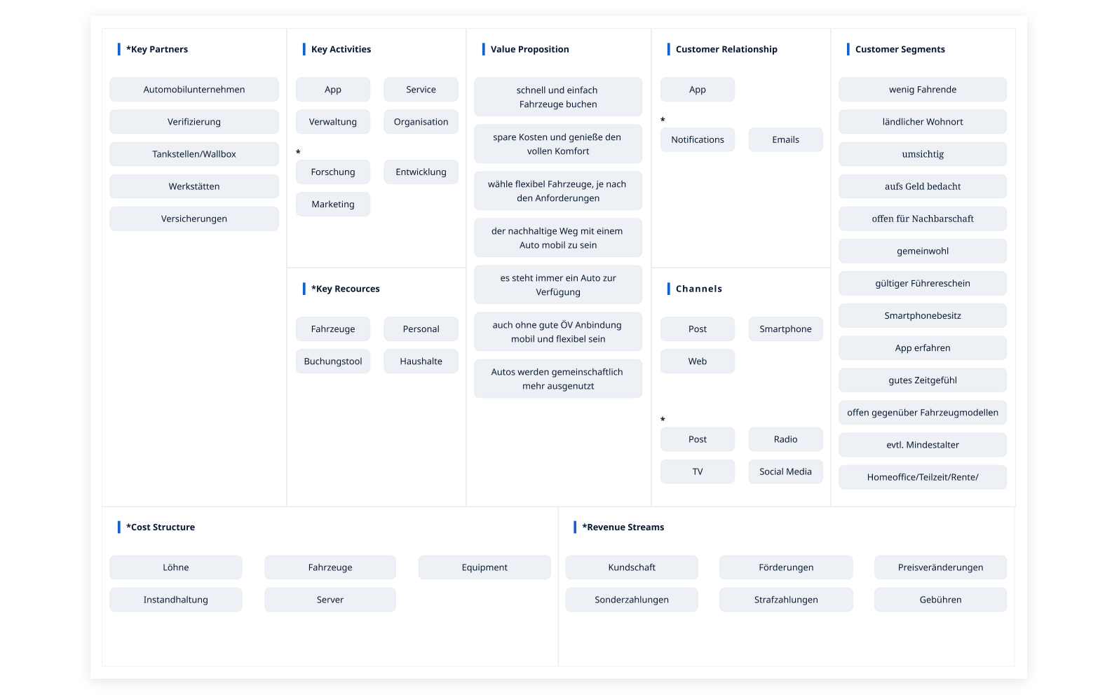
Business Model Canvas – To better understand the overall concept of SharePlus, the Business Model Canvas was used. This is a synthetic diagram designed to provide an overview of the service. References to the value proposition, infrastructure, customers, and financial model are highlighted to help understand what activities are required to provide the service and where potential conflicts may exist.
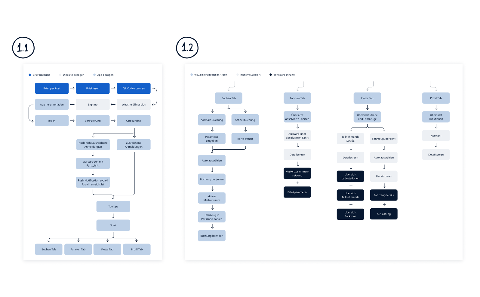
Task Flows – In order to get a better understanding of what actions take place in a defined process and what screens need to be designed based on that, different task flows have been created.
This task flow visualizes the general structure of SharePlus. It starts with: Households receive a letter and ends with the individual functions of the application. It is intended to give a general overview of what the service offers and how an exemplary installation process would take place in a street.
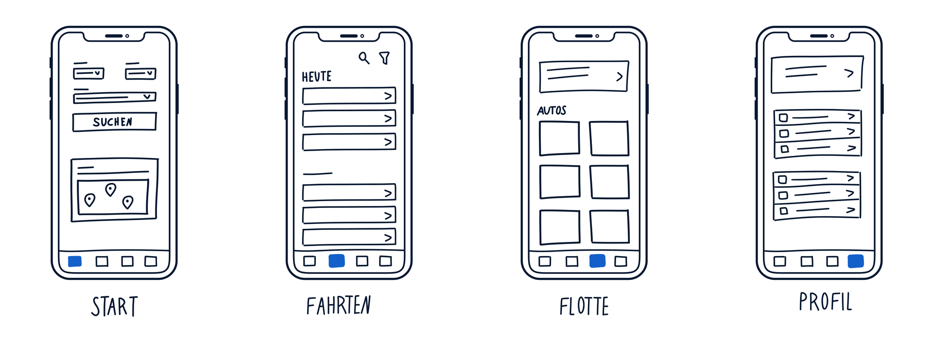
Step 3 – Wireframes and First Designs
To better understand the structure of the screens, wireframes were created. These were based on the flowcharts. Based on this, the first screen designs were created. These were used for usability testing.
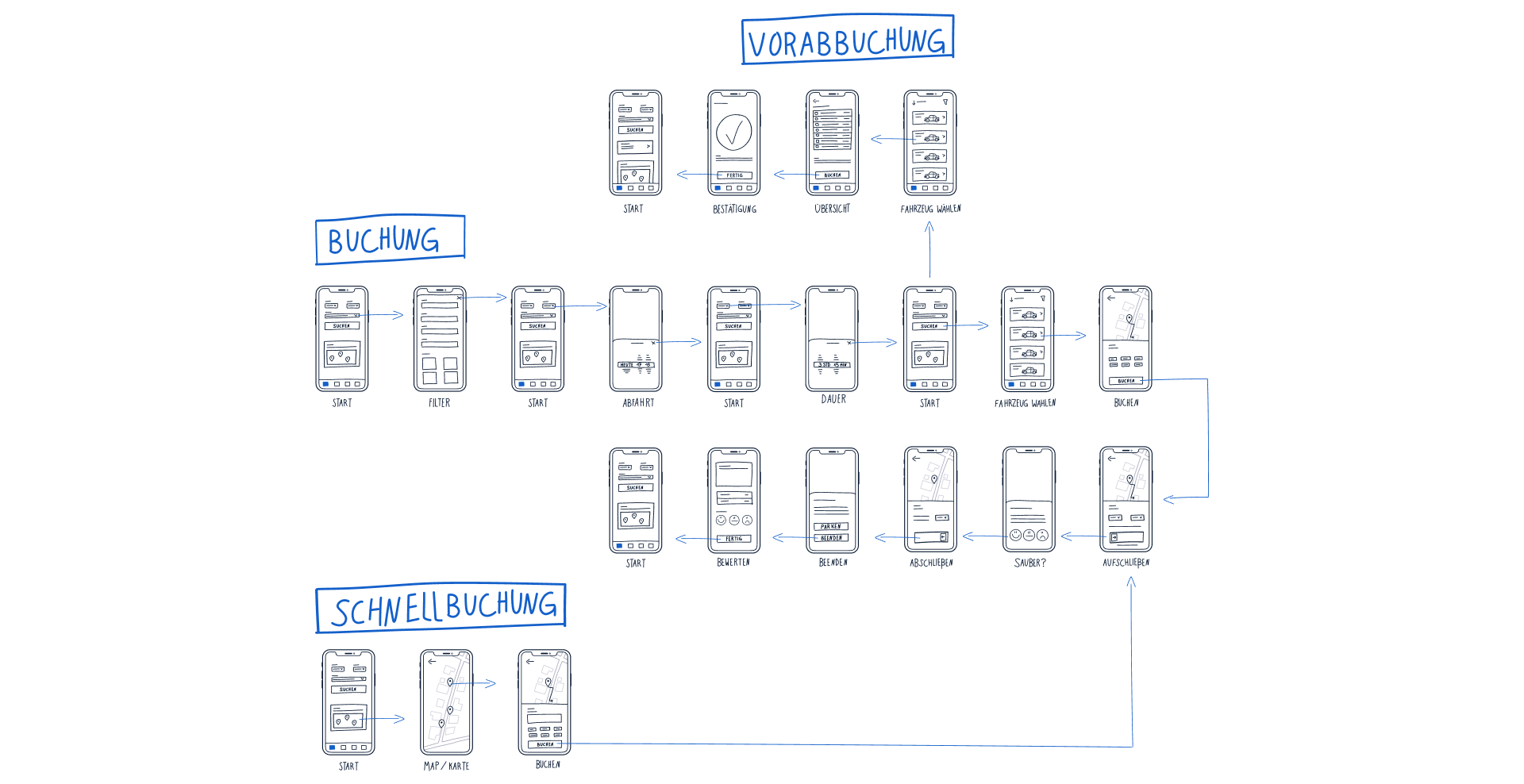
First screen designs (testing base) – To test the application, the wireframes were transferred from wireframe status to screen design.
Step 4 – Usability Testing
Based on the conditions, Dibbesdorf represents an optimal test environment for the app concept developed in this thesis.
Dibbesdorf is a district of Braunschweig, Germany, located on the northeastern outskirts of the city. It is about 8 kilometers from the city center and has about 1,400 inhabitants.
Basic services are available there, but if you want to send a parcel, go to the pharmacy, see a doctor or go to school, you have to go to one of the nearest villages. Some other facts: there are several bus lines that connect to the tram system, there are many commuters who drive to work, and the properties are designed to accommodate one or more cars.
Five people from Dibbesdorf participated in the usability test. Each person had access to at least one car per household. Three had owned their own car, while two participants shared a car in their household. Age ranged from early twenties to early sixties.
Only one person had previous experience with Car-Sharing apps. Another respondent stated that they had already booked an e-scooter through a sharing app.
All test subjects went through the same scenario: booking a car while driving to a specific shopping market to go shopping. A Figma prototype was used on the iPhone 11 Pro Max. After a short introduction, they were observed using the app in the given scenario. They commented aloud on everything that went through your mind while using the app. After the test, there was a short feedback and question session to discuss any concerns, suggestions for improvement, and behavioral patterns.
Testing results (excerpt):

Headlight button – Especially when several vehicles are parked close together or you have to search for the booked vehicle in the dark, the flashing function makes it much easier to find the car. Since license plates no longer need to be checked. This feature was not previously included in the designs and was added on request.
Pins – Instead of static looking pins, more dynamic pins are used to illustrate that the cars are not permanently parked at the spots, but can be booked flexibly and parked on the street. This is made clear by car icon and the circle at the end of the pin.
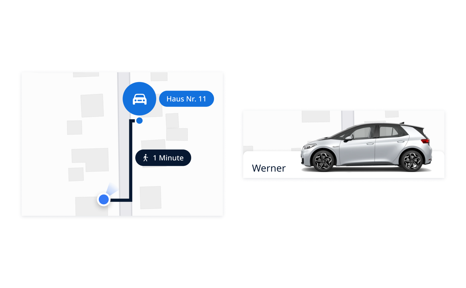
Naming – Four out of five respondents were in favor of naming the vehicles. According to them, this gives the vehicles a personal touch and recognition value. However, according to an article by TÜV NORD GROUP, only one in seven people name their car, and one person was present during the test against naming. So there will be an option in the Profile tab under Settings to display the model name instead of the name.
The same goes for walking minutes. According to the feedback, there was a wish to be able to hide this information because the routes within a street are not always very far and are also known. However, since this information can have a very individual value depending on the distance, street shape, or personal attitude, there will also be an option to show or hide the display in the Profile tab, Settings.
Warning Messages – If the rental period is exceeded, a warning message is displayed. However, according to the test results, it should light up in orange instead of red. Red made the testers too unsure. In general, it turned out that messages of any kind should be displayed in color contrasts.
Step 5 – Final designs
What else has changed? I made additional design improvements outside of the usability testing.
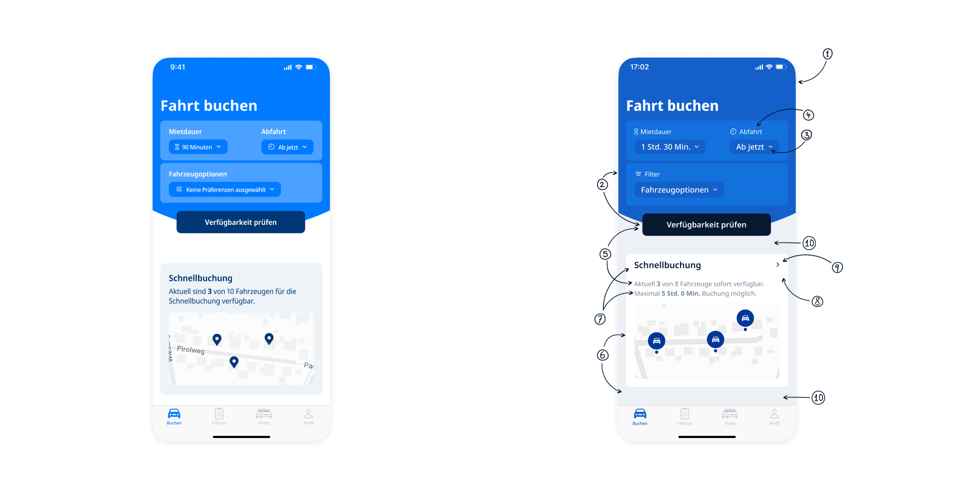
Before – Due to the tight schedule during my thesis, it was important to create the first screens that could be used for testing in a short amount of time. Although this status quo was already great for testing, there were still a few things that bothered me visually. So I implemented the feedback and continued to make improvements.
After – (1) A darker shade of blue to provide more contrast with white text. (2) Primary and secondary colors are more contrasting. (3) The focus is on the information, (4) the headline moves to the background and gets icons for visual support. (5) Font adjustments. (6) The background appears in gray, the tile in white. (7) In addition, there is a clear hierarchy between primary and secondary text. Also (8) visual separation, (9) interaction clarification, and (10) spacing adjustments.
Parts
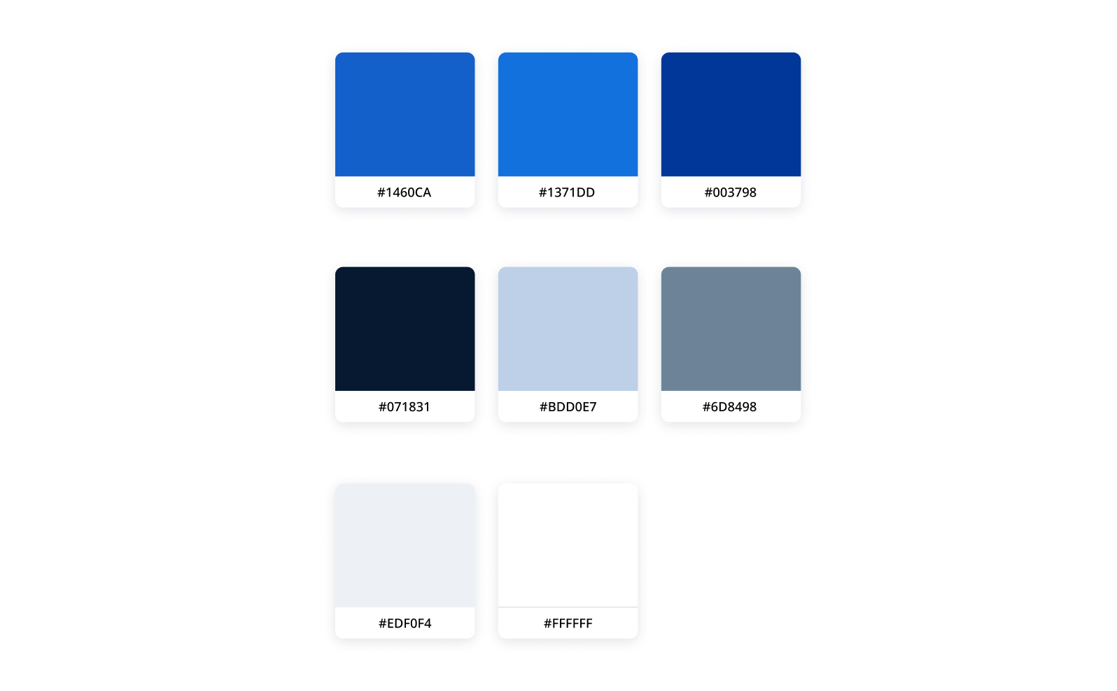
Main color palette – Despite the many different elements, the goal was to achieve a harmonious, not too colorful overall effect. This is achieved by using different shades of blue. While the backgrounds are colored in a reduced way, different blue accent colors provide a visual hierarchy within the screens.
From the moment the map is displayed, the navigation is deliberately changed. The background colors also change. Background Primary becomes Background Secondary and Background Secondary becomes Background Primary. This maintains a clear hierarchy and keeps the screen clean and uncluttered. In general, primary colors highlight the most important elements and secondary colors complement them.
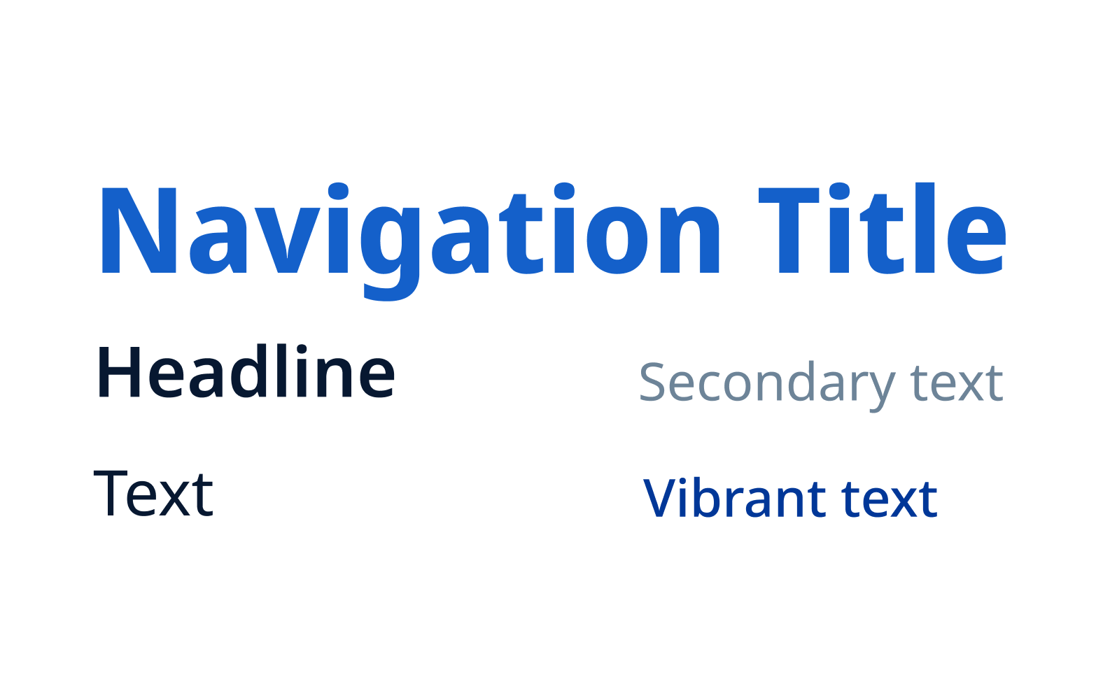
Font – The choice of font in this application context fell on the Noto Sans and the Noto Sans Display. On the one hand because of their aesthetics and reduced appearance.
On the other hand, the Noto fonts were for the whole world. Besides the many possible styles, it allows “typographically correct and aesthetically pleasing global communication in over 1,000 languages and over 150 fonts”. (Google Fonts) This feature is particularly suited to the app’s concept of being able to quickly reduce emissions globally.
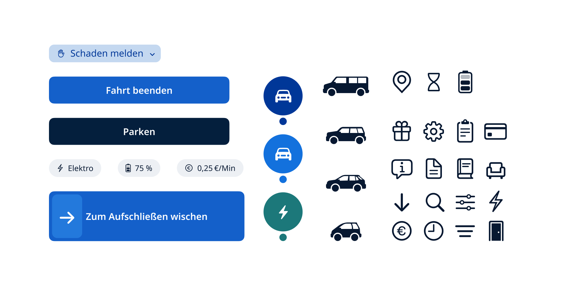
Elements – A small overview of the elements used. Most of the icons shown are Apple’s SF Symbols. These were chosen because of their clean look and the large, flexible and coordinated selection of icons. However, not all SF Symbols were convincing in the respective context. Therefore, some self-designed icons were added. In addition illustrations of the vehicles have been drawn.

App logo – The logo represents a parking zone, the so-called home zone. The rotated arrangement is meant to symbolize flexibility and dynamism. Due to the smaller space in the App logo representation, the written plus becomes a + sign.
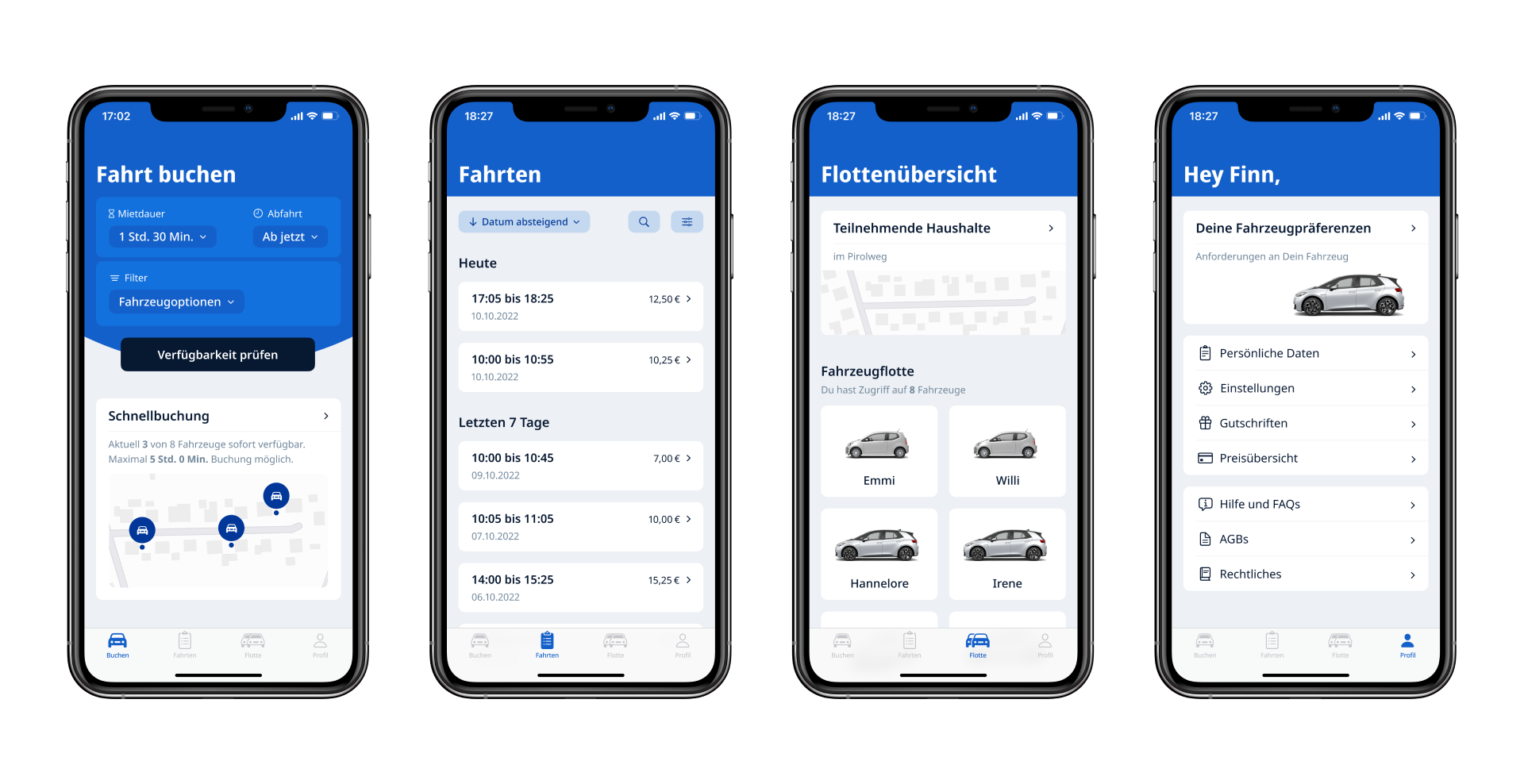
Tabs
Alerts
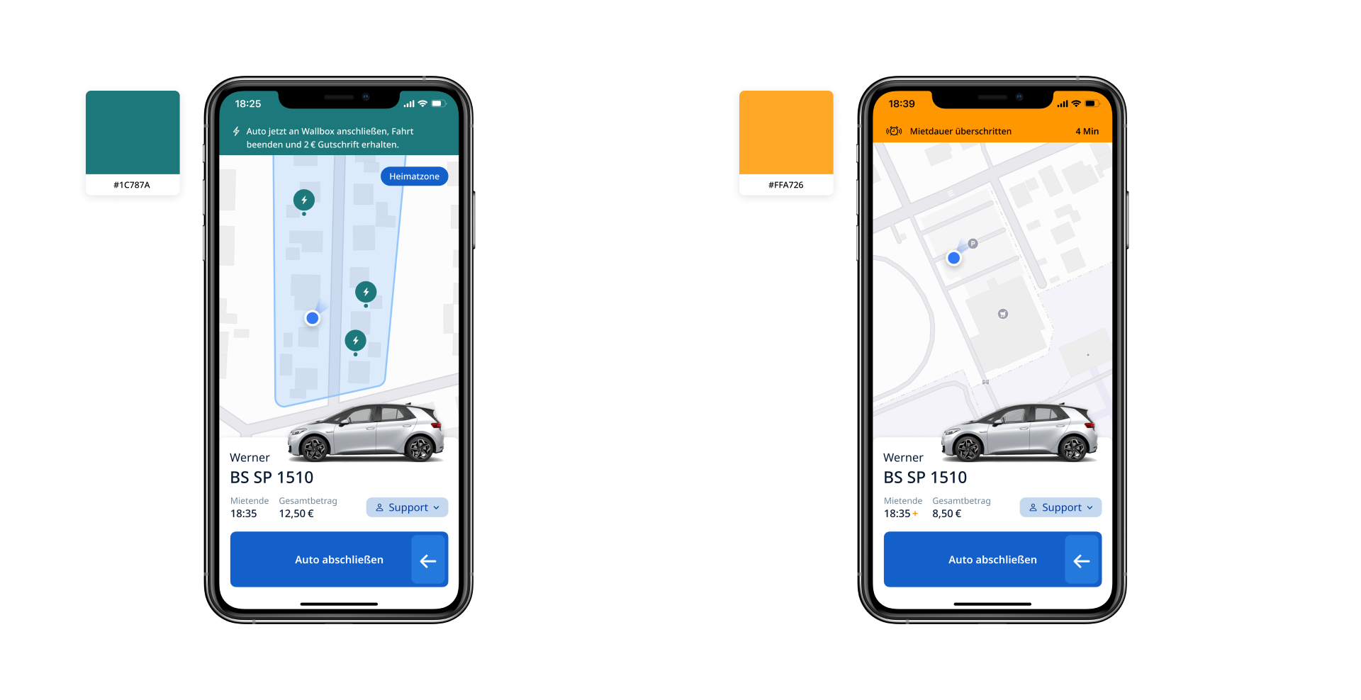
Loading/Fuel – In case of arrival, an alert will be displayed to remind the driver to charge the e-cars. The cars not being charged enough was the main concern during the usability tests. As an incentive, an exemplary credit of 2 euros is offered. In addition, the charging stations are displayed. The color: Green has a positive connotation. In this case, green should also stand for money.
Warning – In case we exceed our rental period, the excess duration could be displayed. In addition, a small note at the end of the lease. About the color: Orange because according to usability tests red is too aggressive/frightening.
Short flows
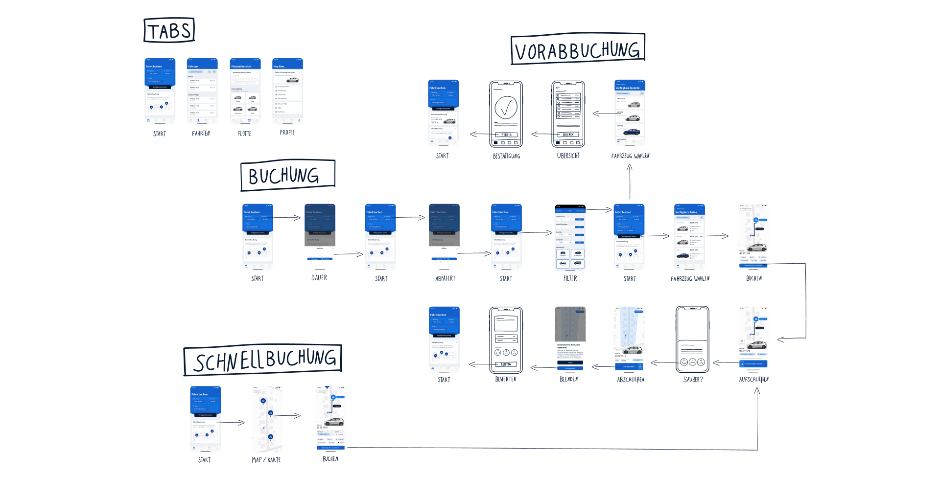
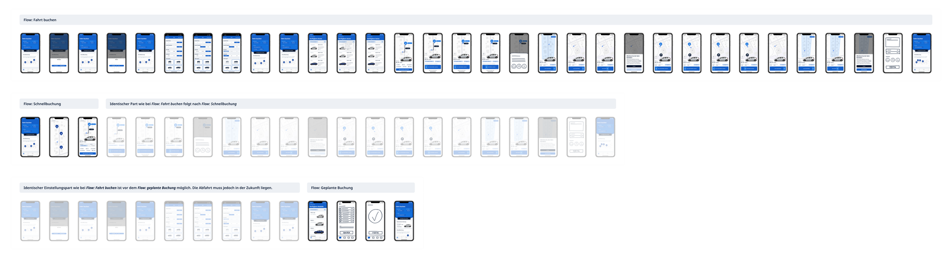
Detailed flows
Recap – Long story short
The tests have shown that such an idea has potential! However, many things need to be taken into account. For example, neighborhood conditions, personal attitudes, driving habits and relationship to one’s own car, finances... Intensive field testing is also necessary.
Looking back, it was a very exciting experience for me to work on such a complex and exciting product with sustainability potential.
PS: in case you would like to read my entire thesis, please feel free to contact me. 😉