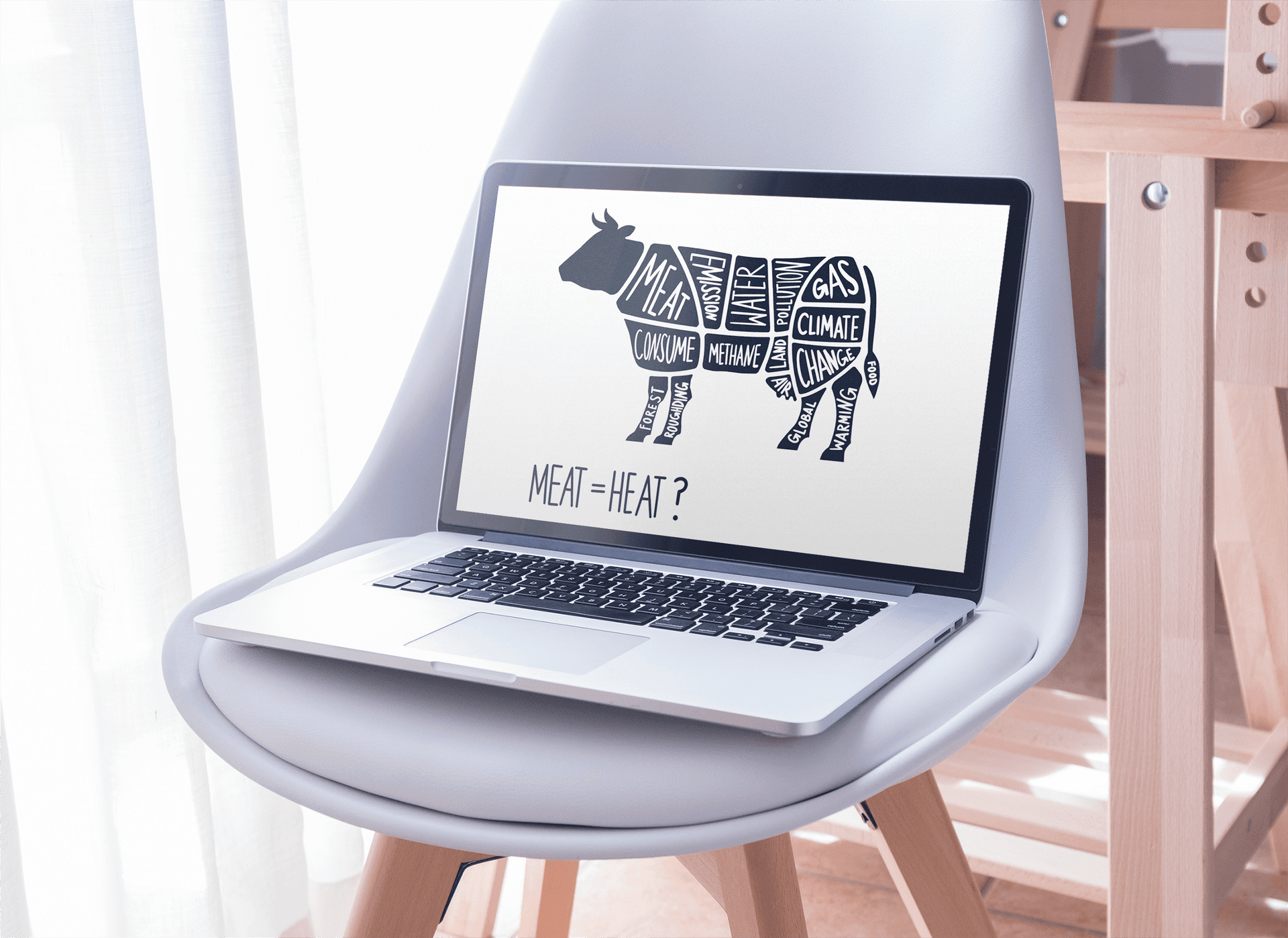
Meat = Heat? – A scrollytelling experience that makes the impact of our meat consumption on climate change clear and easy to understand.
Project information
Web Design · Scrollytelling · UI/UX · Infographic · Climatechange
Summer 2020
University Project with Lele Schlaich by Prof. Boris Müller
My Part – Drawings, Infographics, Concept, Content
About the project
2020 was the climate semester at our University. In Professor Boris Müller’s course “Klimagrafik” (Climate Graphics) we dealt with Scrollytellings, Websites and Infographics that show different aspects of climate change, global warming and the related major global challenges of the 21st century.
My group partner and I decided to work on the topic of meat consumption and global warming.
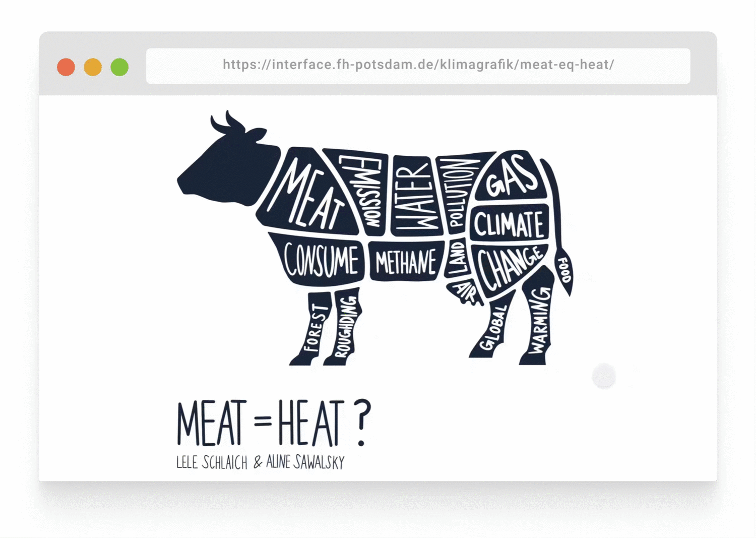
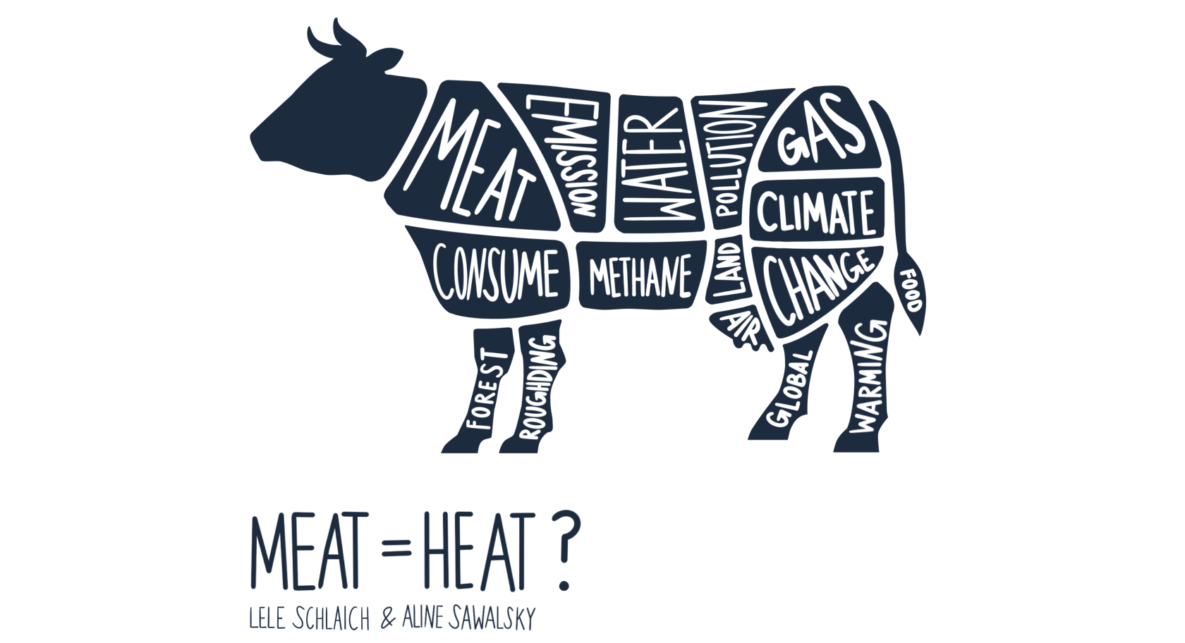
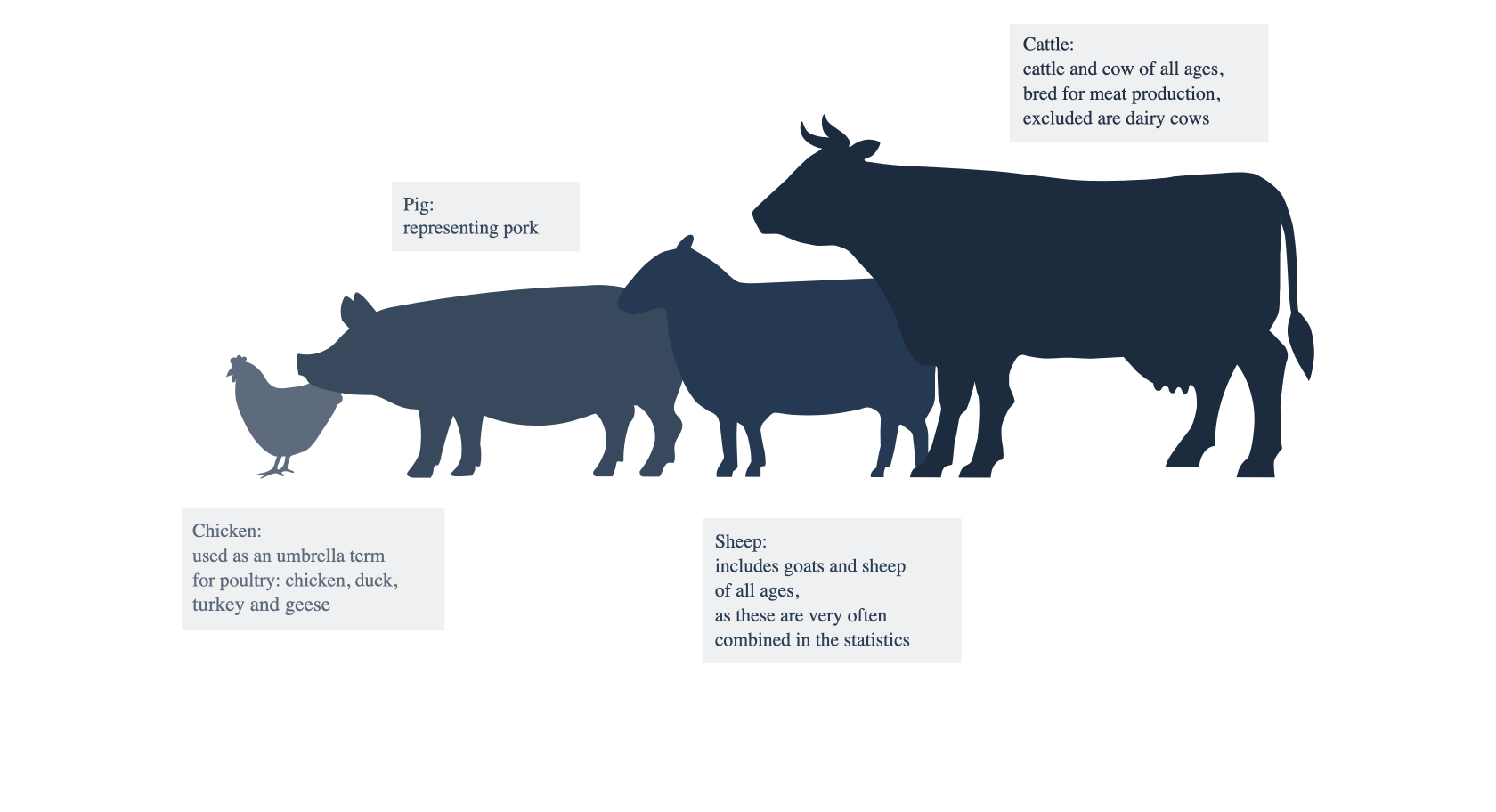
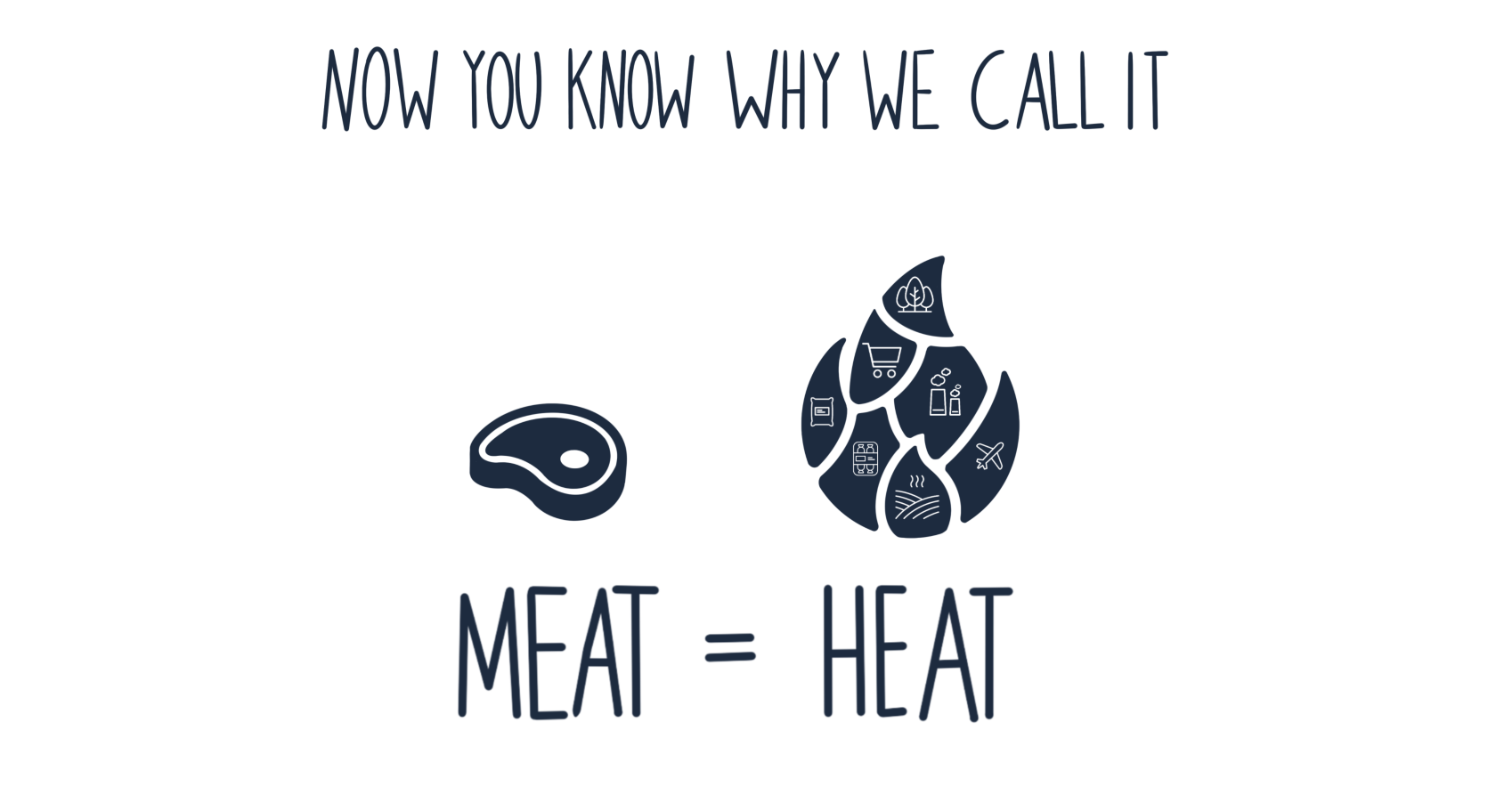
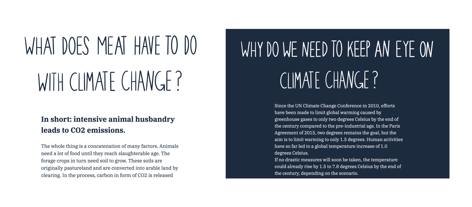
What does meat have to do with the climate? – Well, there are quite a few connections
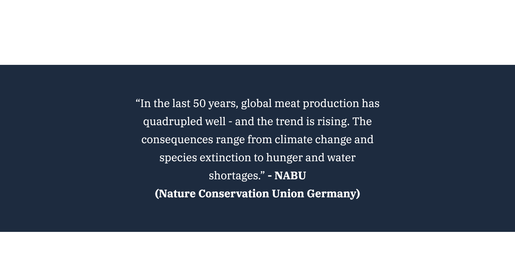
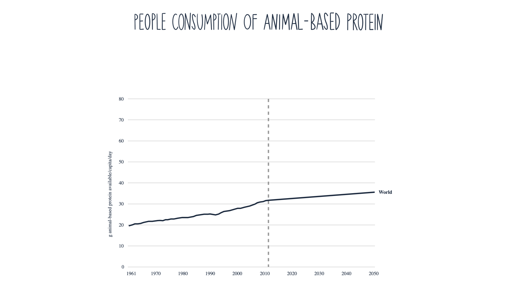
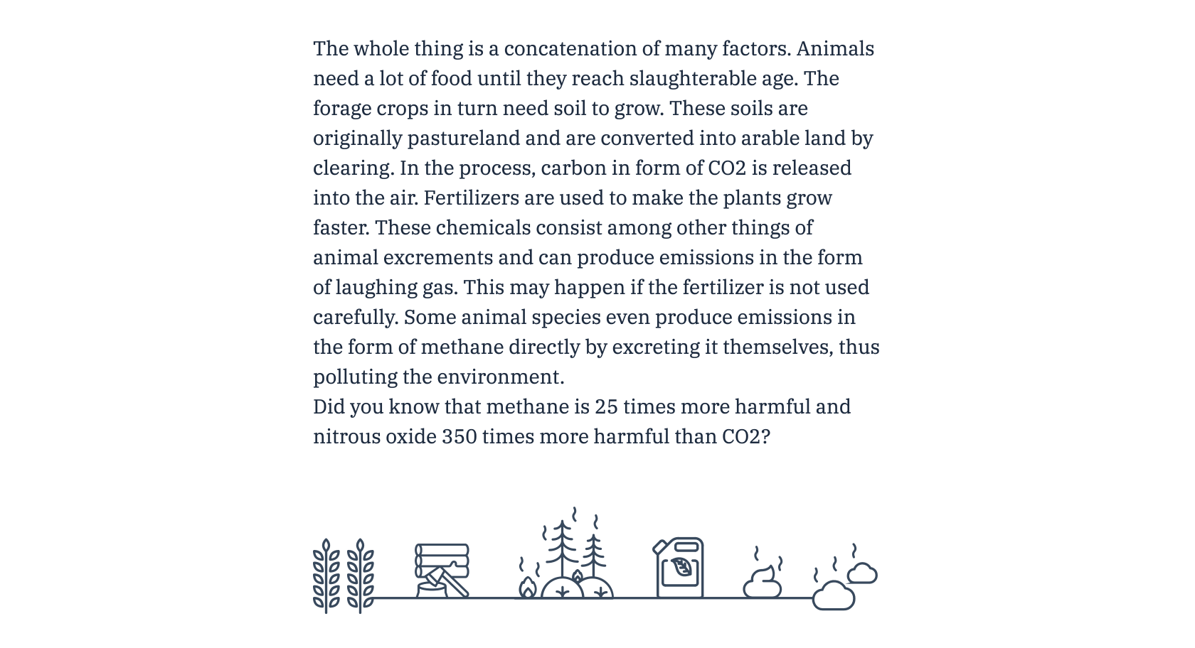
“In the last 50 years, global meat production has quadrupled well – and the trend is rising. The consequences range from climate change and species extinction to hunger and water
shortages.” NABU
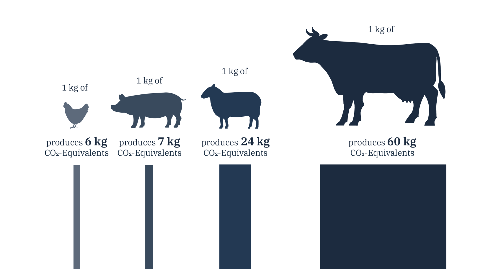
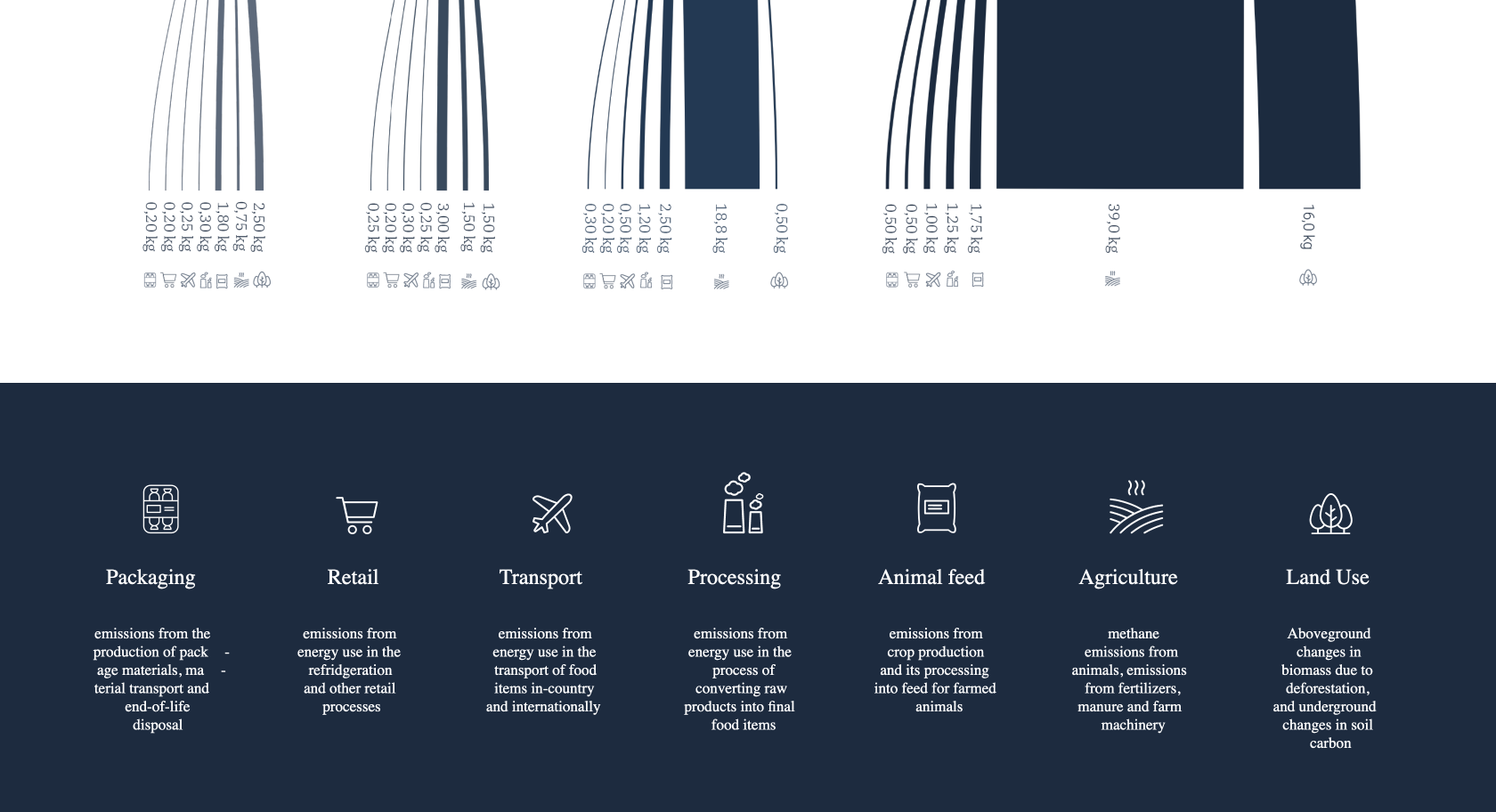
Thus the feed of the animals is based on fodder plants that need soil to grow, which in turn is cleared. For a faster growth fertilizers are needed, then a lot of energy is used in the stables, to the transport up to the meat processing, packing and cooling in the supermarket.
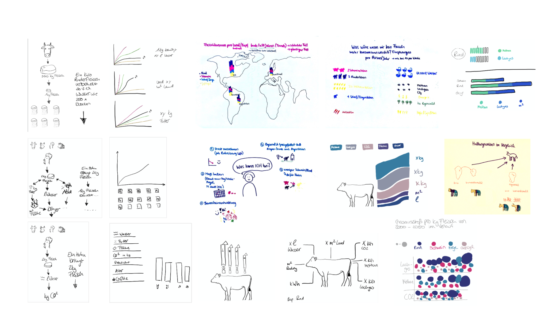
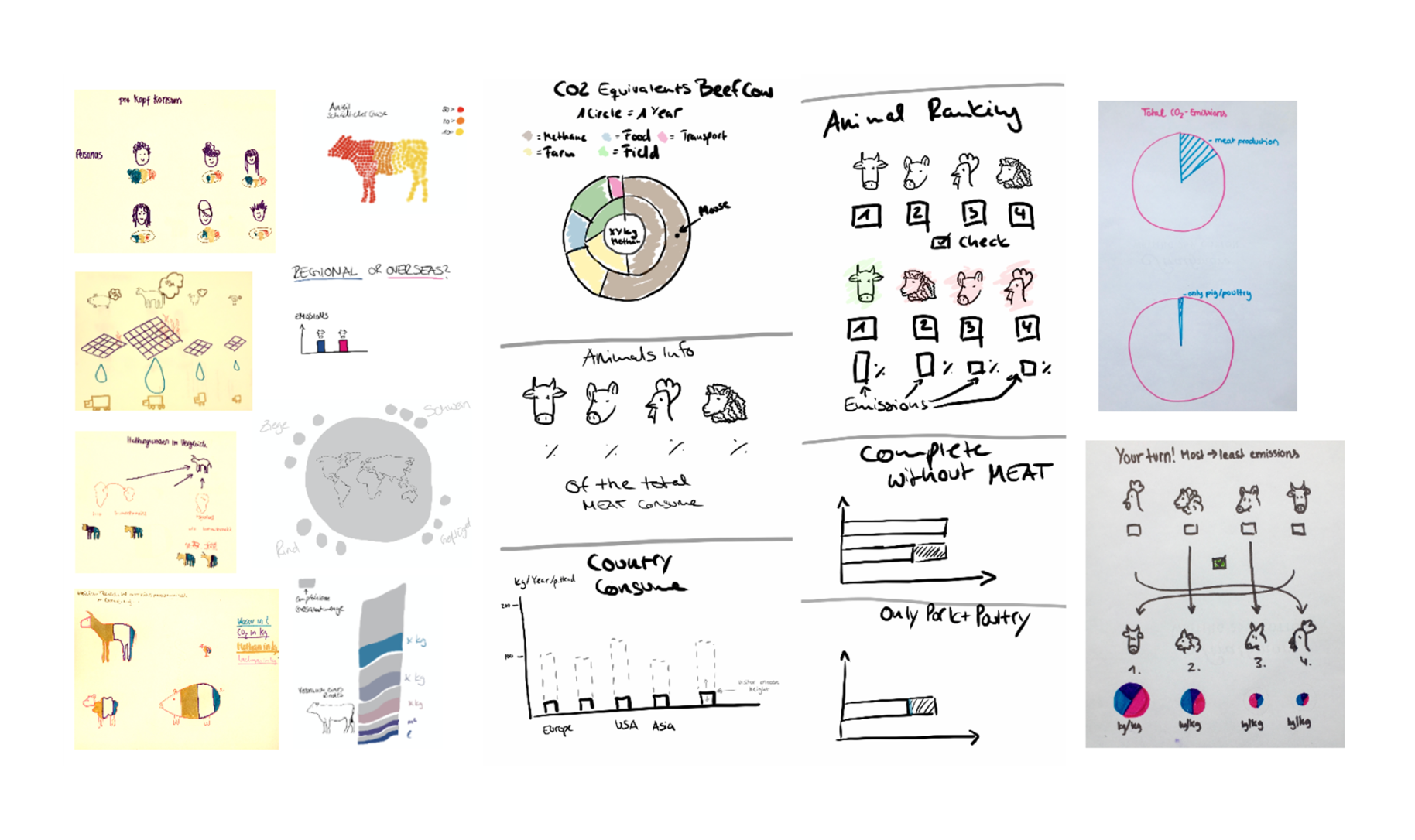
Brainstorming – Many ideas brought us to the final concept
We had a lot of approaches and different ideas, here is a small selection of sketches that came up during our brainstorming process.
The Structure – Show the essentials, educate without persuading
It was important for us to underline the importance of the topic, but we did not want to be missionary, and we wanted to communicate on a personal level to reach people. We also wanted the graphics to be catchy and easy to understand. Our biggest motivation for the points just listed came from our research, as we noticed that until now there was no clearly designed and summarized website that illuminated the topic in its entirety.
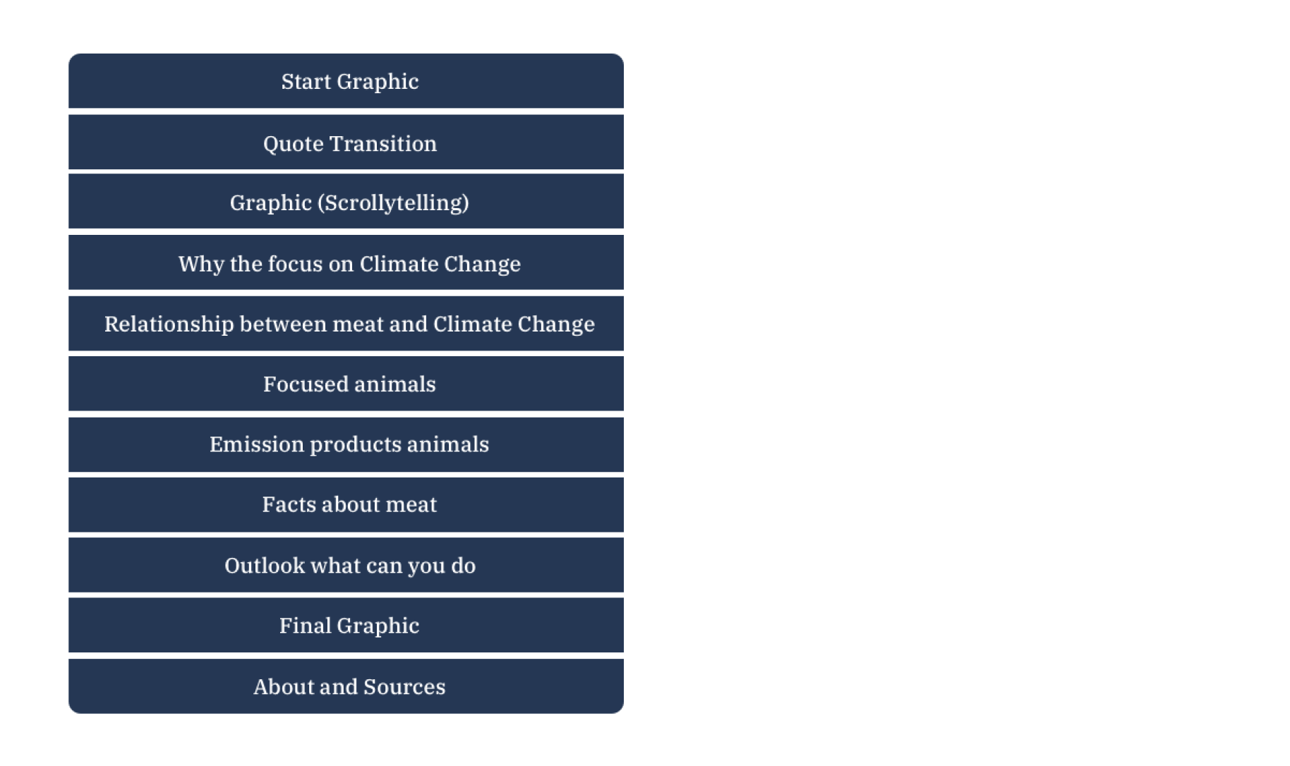
The following graphic shows our structure with the respective topics.
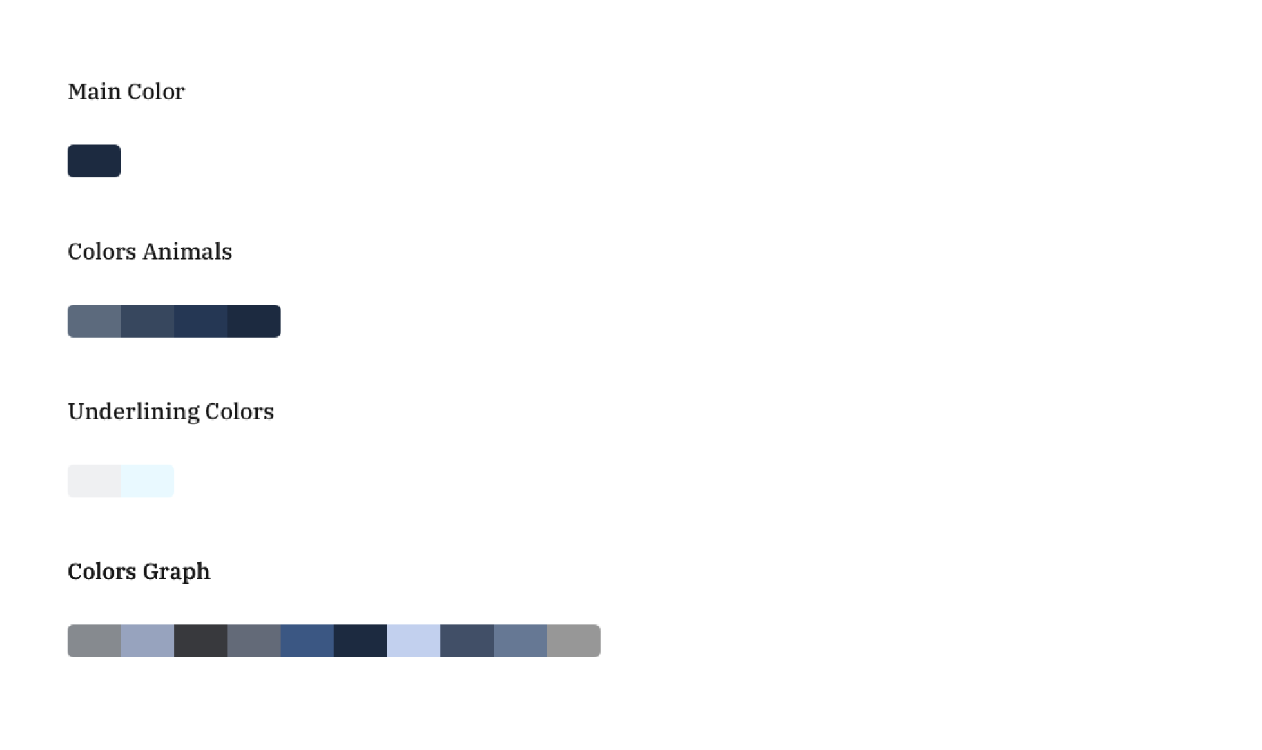
The color palette – Less is more
We have deliberately chosen blue tones because they provide a good reading flow and stand for longing and clarity in their symbolism. Likewise, these colors ensure that the user can deal neutrally with the topic without being influenced by a biased opinion.
Fonts – The mix makes the difference
In order to visualize a communication on a personal level we decided to write the headlines ourselves. To match this we wanted a flowing text font that is not too laggy and easy to read and should go with the handwritten character. For this reason we chose IBM Plex Serif.
Coming soon – Publication in the digital learning and event space, “Wi.Fo!-Lab” of PWC
After the publication of our project, we received a request from PWC who would like to use our cover image for an environmental theme week together with the Umwelt-Akademie e.V., Munich in their own digital learning space, “Wi.Fo!-Lab” of PWC.
The target group are approx. 500 secondary school students, taking part in this at the beginning of may. Photos will follow.
Website – A short visual impression through Screenshots
To get a first impression of our project you will find a small gallery with pictures. Find out more about this on our website.