BVG App Redesign – A new look for Berlin’s transit app: easier navigation, clearer journeys, and faster ticket access.
Project information
Transportation UI Design · App Concept · Icon Design · iOS HIG
Winter 2020/21
University Project for the course “Apps & Details” of Frank Rausch
Navigating within Berlin
The Berliner Verkehrsbetriebe (BVG) offer with their BVG Fahrinfo App many functions around the local and partly even long-distance traffic.
It provides information as well as ticketing for all those who want to use public transport within Berlin and Brandenburg.
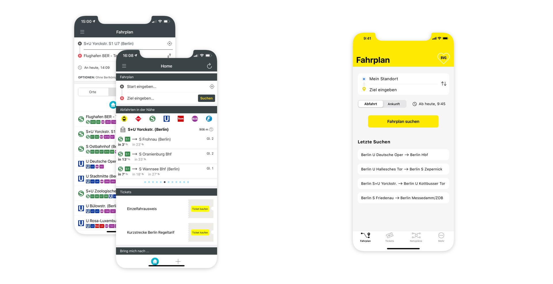
Via a hamburger menu, the user can for example select a preset quick access, search for timetables, buy tickets, access maps, and many more functions.
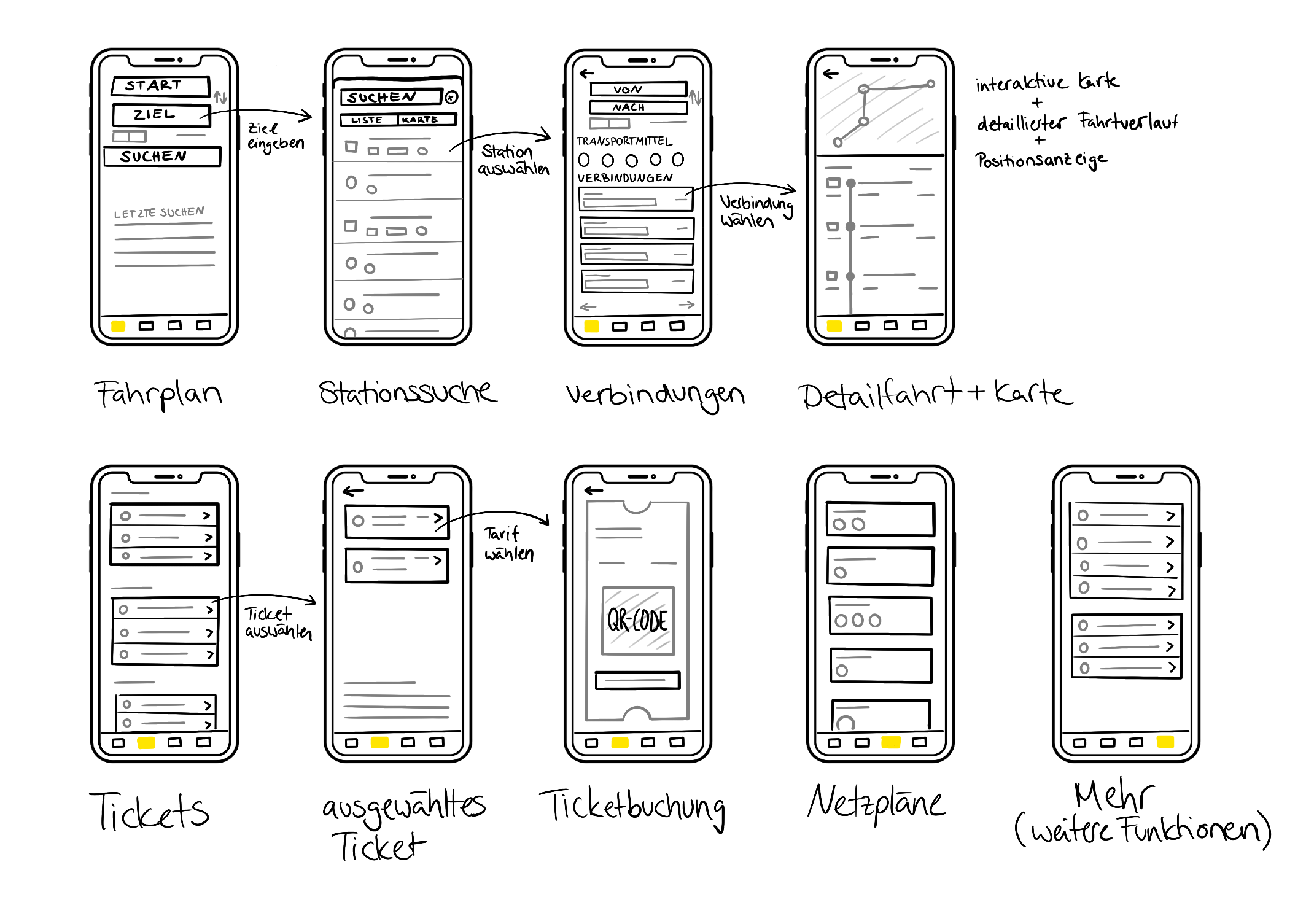
Simple sketching of the redesign for visualization
The redesign
As a basis for the redesign, I talked to users of the BVG app in addition to my own analysis.
In the original BVG app, few purely native elements of the iOS Human Interface Guidelines are used, in addition, there are many functions that you can almost always handle from anywhere, so unfortunately many functions remain unused.
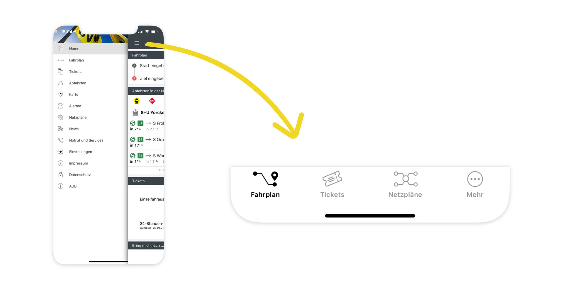
Simplifying navigation within the app.
I first converted the hamburger menu into a TabBar with the four tabs: Fahrplan (timetable), Tickets (tickets), Netzpläne (network maps) and Mehr (more).
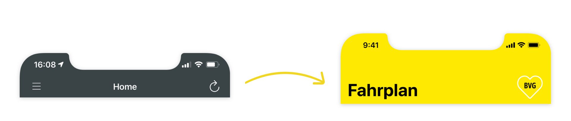
The branding of the app was also adjusted with the goal of a clearer attribution to BVG.
In addition, throughout all screens at the info were reduced and, if necessary, larger fonts and spacing were implemented to create more clarity. The font used is Apple’s house font San Francisco.
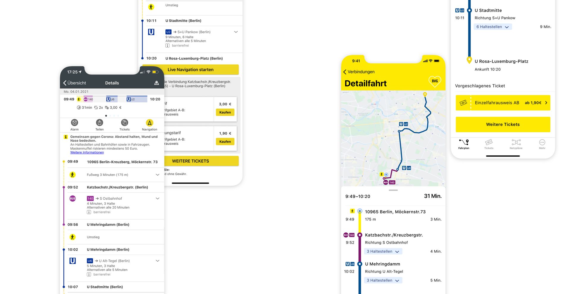
Timetable (Fahrplan) – Reach your destination faster
Due to the importance, my goal was to make the screens as simple as possible to allow the user an easy and smooth timetable search.
Before – Two different ways to search the timetable. Often only the timetable on "Home" is used by users. Other functions are ignored because they are unclear or not necessary.
After – Focus on the timetable search and the required settings. To speed up the search, “my location” is always preselected and the trips that were last searched are shown.
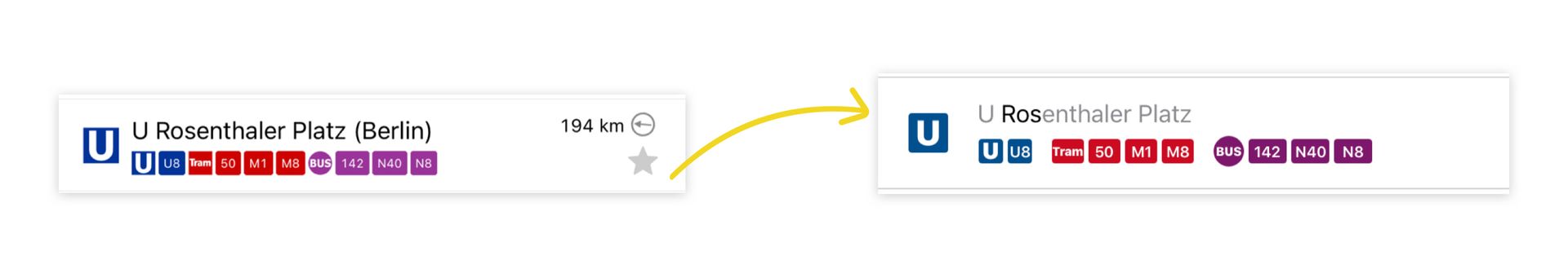
Before – Modal View with small fonts and symbols, little space and a lot of information. Partly difficult to read.
After – To enhance the visual impression, the letters typed in the search field that correspond to those of the stops appear in black. In addition, a segmentation and division by means of transport has been made for a better overview.
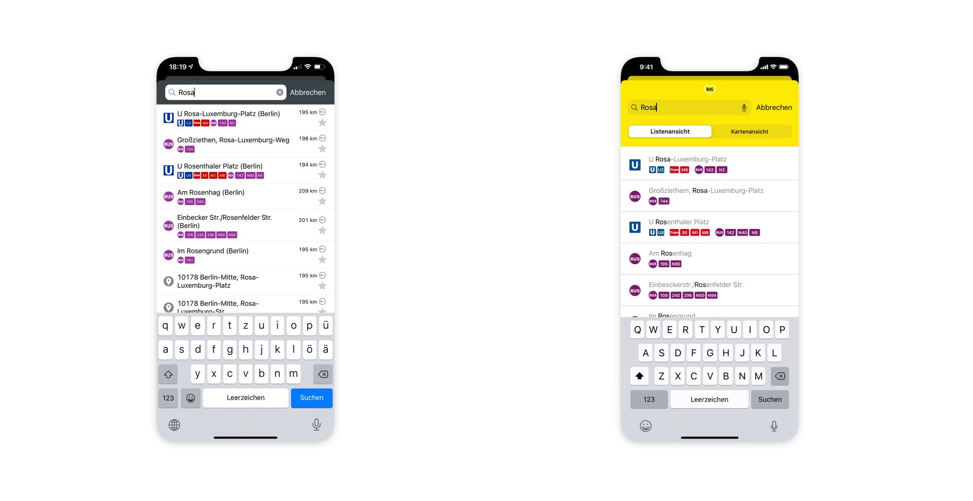
Before – A lot of information, very small font, unlabeled icons/symbols too many unused options that users find confusing rather than coherent.
After – More prominent transport selection function to make selection easier. Less information and larger fonts for a clearer Screen and better comprehensibility. The centered position of the icons/labels in the colored transportation segments visually simplifies the respective travel time.
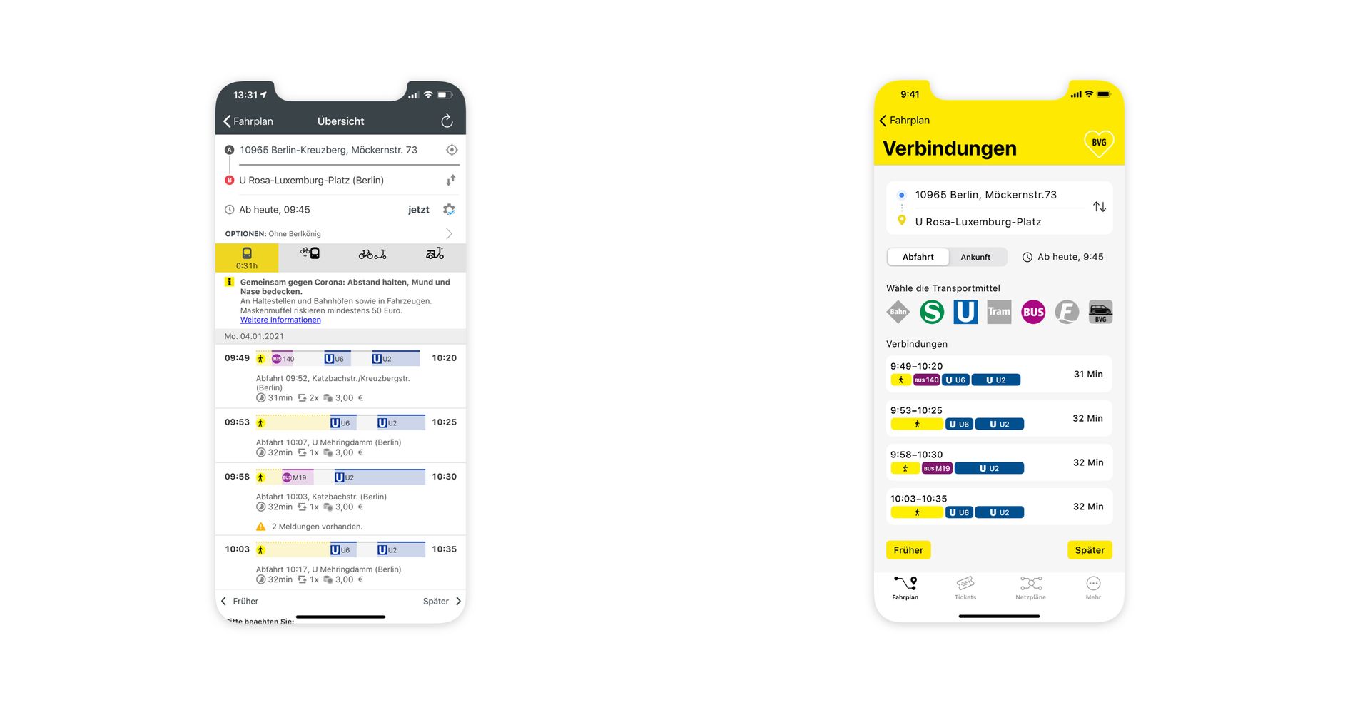
Before – Again we have a lot of information, small fonts, unlabeled icons/symbols and too many unused options.
After – A combination of the map with the timetable. Zoom in the map to get more information. The locator moves with the position, so you can see where you are. The dots symbolize the changes. Interactive stops and larger fonts for a clearer interface.
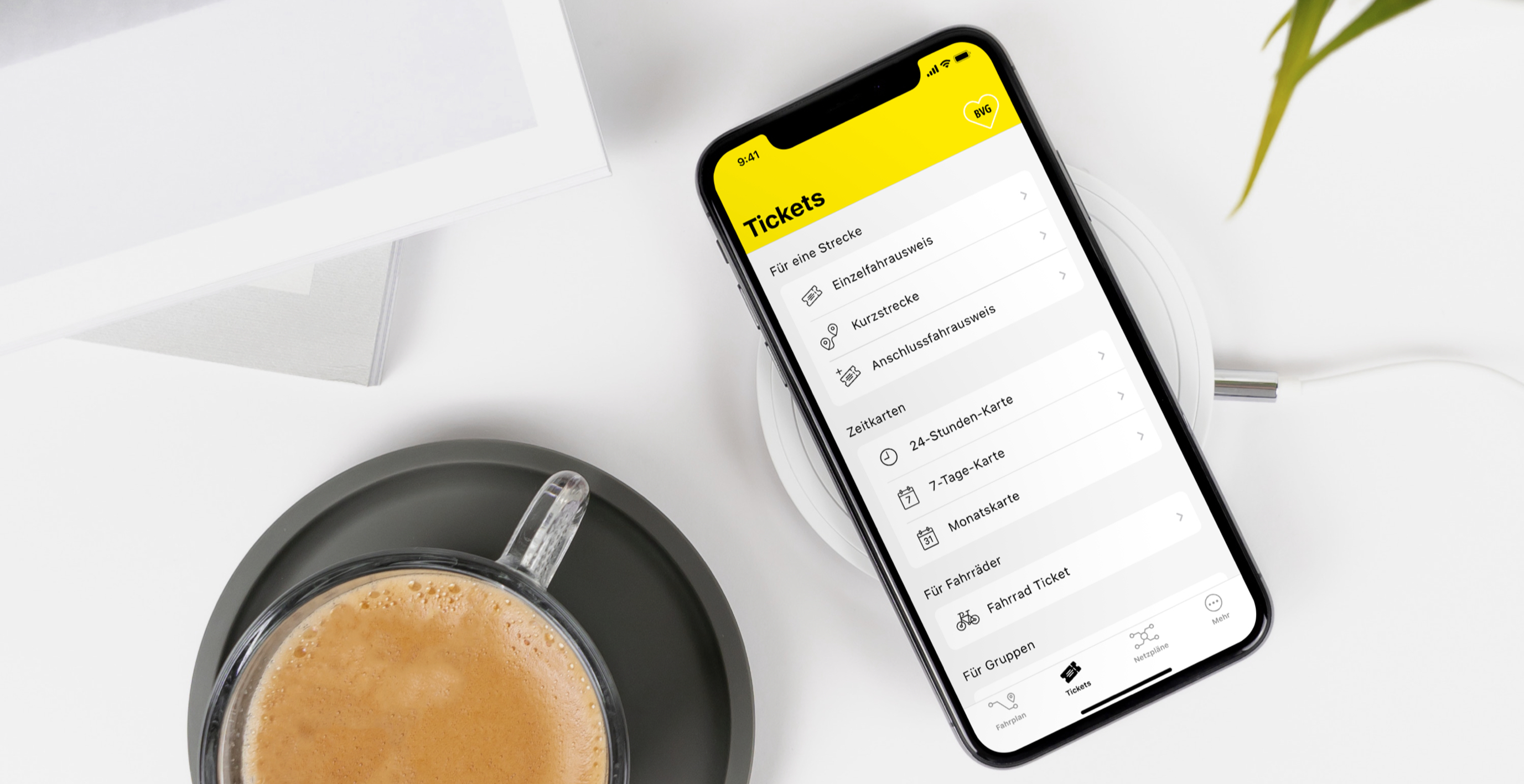
Tickets – Your ride, your pass. Find it fast.
Before it was not easy for the user to find the right ticket especially for tourists due to the structure and lack of information.
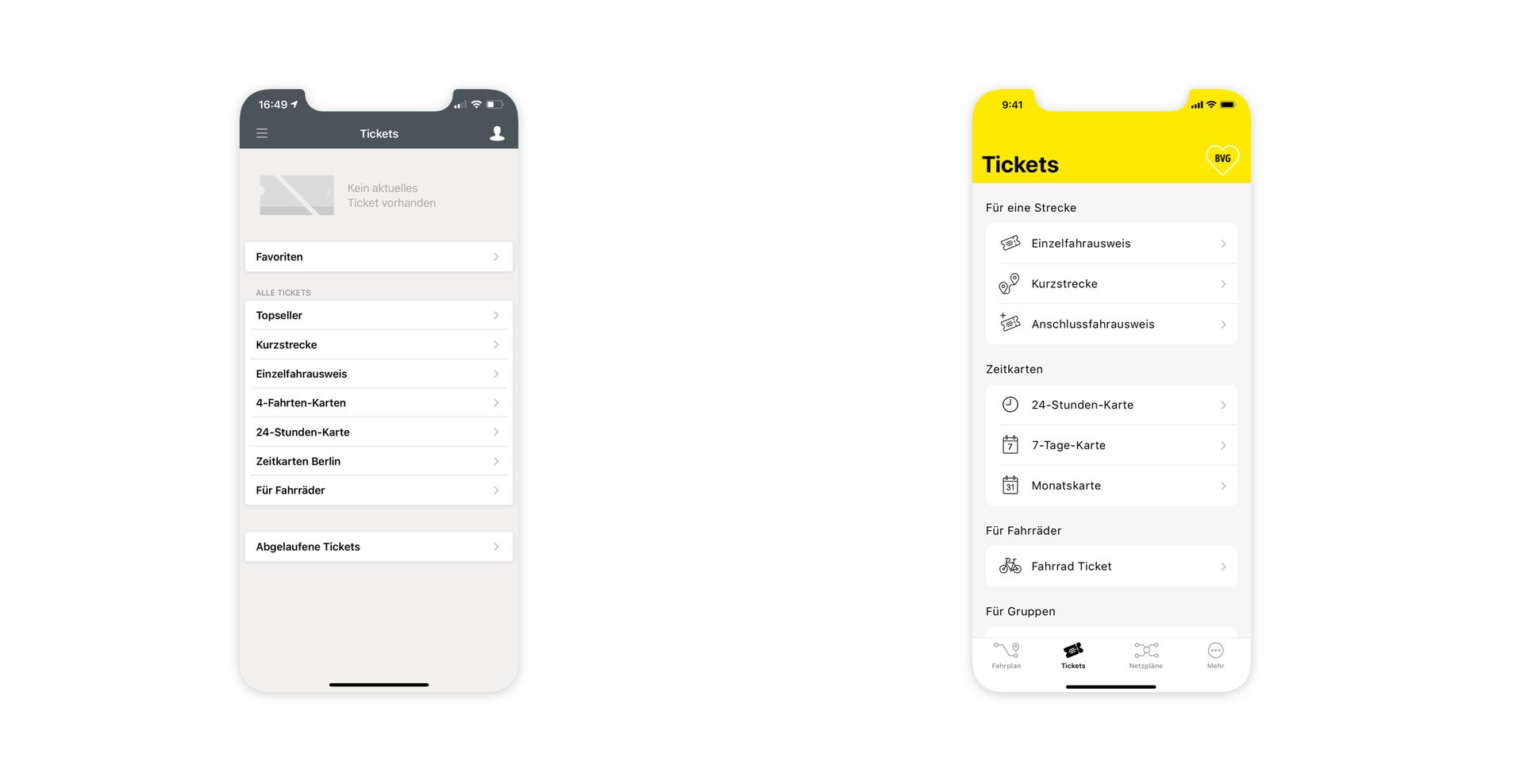
Before – Small font, narrow columns, users were not sure which ticket to buy.
After – Divided into sections that are intended to make it easier to find the right ticket. Matching symbols/icons for visual support.
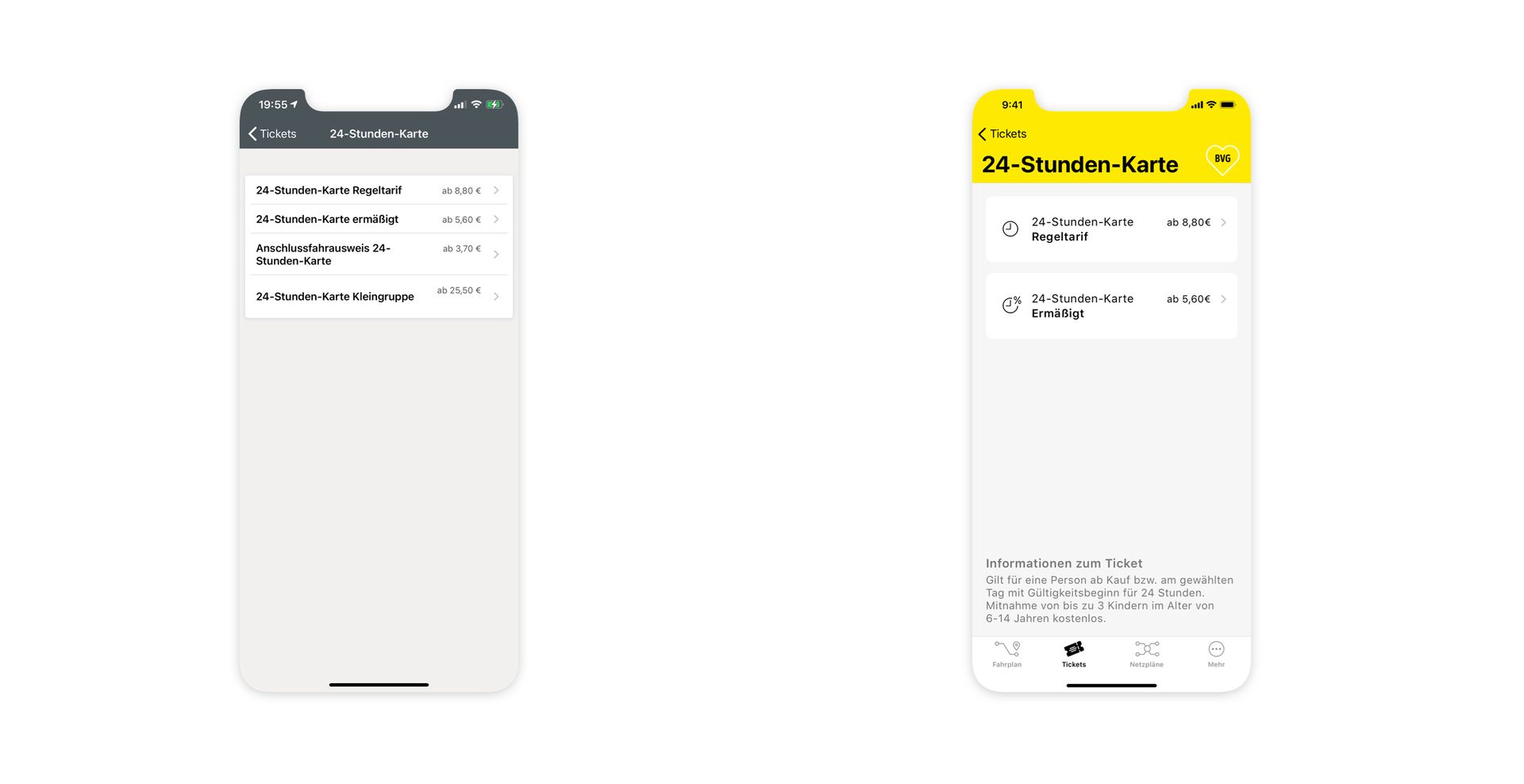
Before – Again small font, narrow columns, no info about the ticket and the validity.
After – Various standard tariffs appear for selection, as well as the information listed below for the respective ticket.
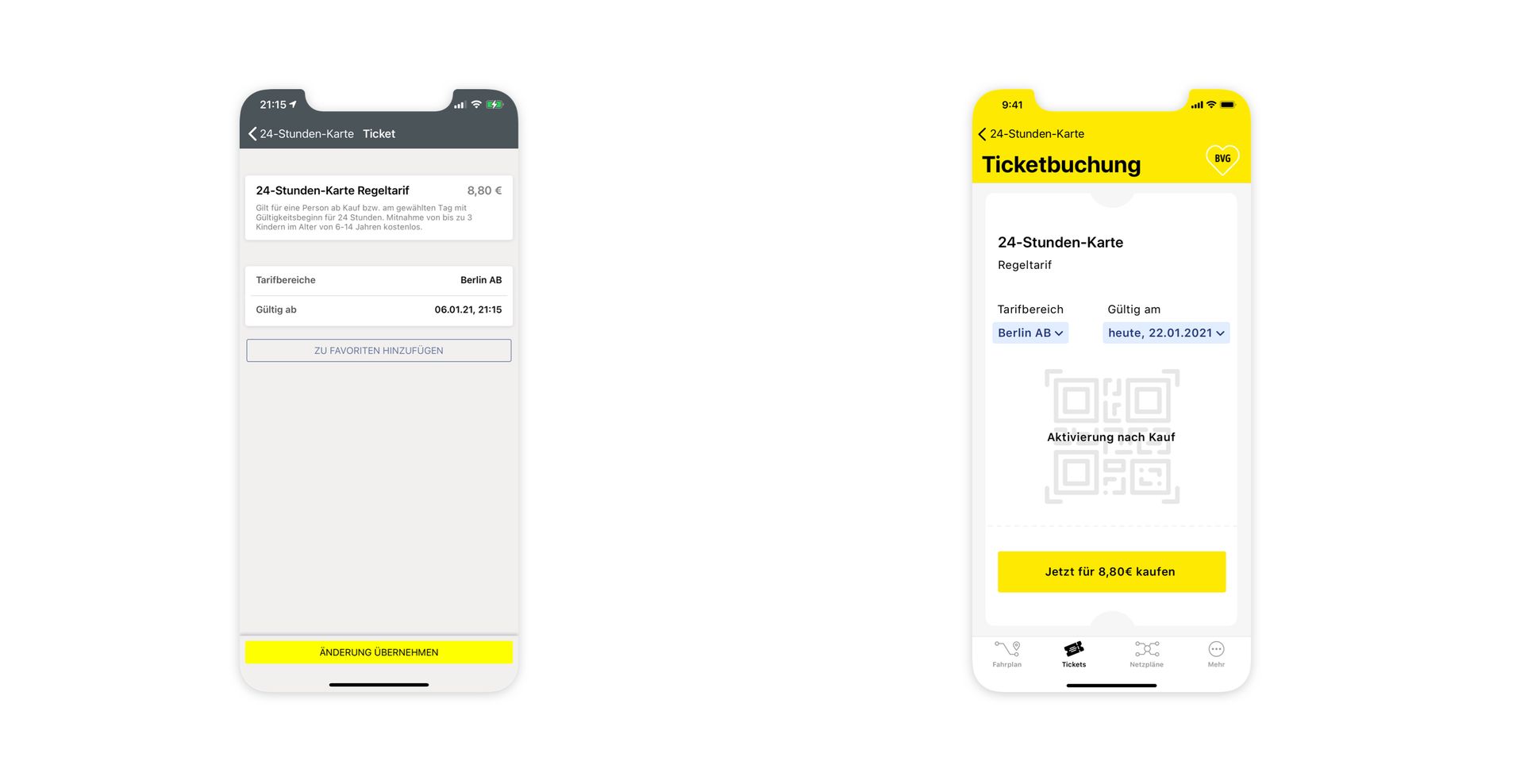
Before – Partly very small font, ticket areas and validity do not look interactive. Ticket booking does not look like you are buying a ticket.
After – Visual ticket is displayed. Interactive presentation, the fare range and the day of validity can be selected.
Network Plans (Netzpläne) – Guide your journey
Network plans are available at every stop and in subway stations, helping passengers navigate efficiently. They remain popular and widely used today.
To enhance user experience, this feature has been given its own dedicated tab. In the original app, timetables were buried in the middle of the hamburger menu, which users criticized for downplaying the app’s importance and accessibility.
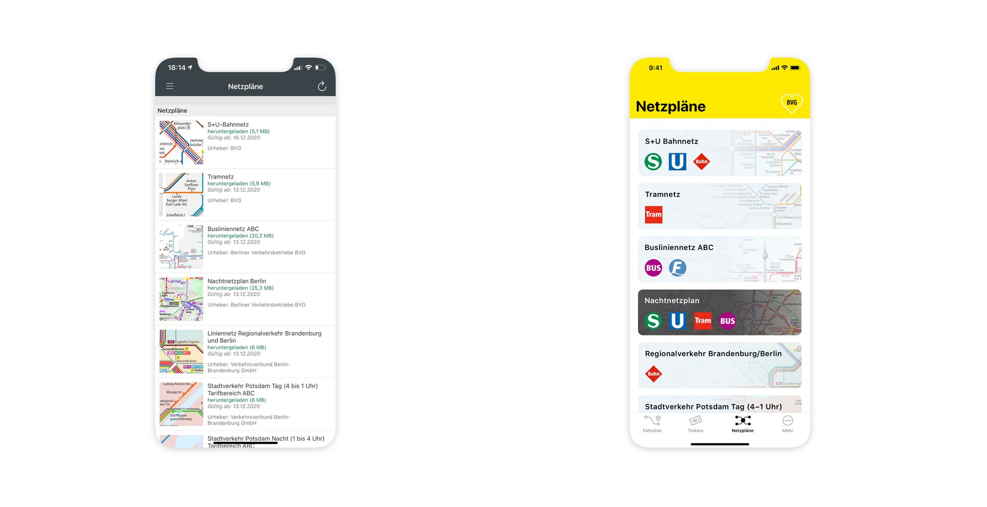
Before – Partly a lot of text, small font, some infos are not relevant for the user and difficult transportation assignment.
After – The coloring indicates whether it is a day or night network plan. Transport symbols make it clear which means of transport is listed in which map.
More Tab (Mehr) – All the extras in one place
Practical features that support you beyond your current journey.
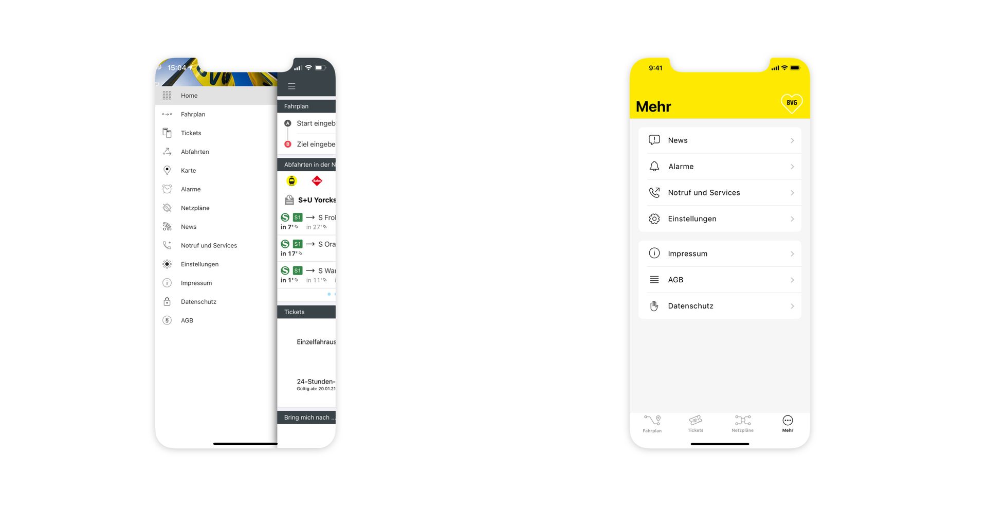
Before – Small font, little space and not coordinated icons/symbols different with different size and thicknesses.
After – Divided into two groups according to functions and written elements. Icons stand before the text for a better visual assignment.
Icons – Consistent design for a cohesive look
To achieve a harmonious visual style, I utilized a mix of Apple SF Symbols, modified versions, and custom-designed icons.
SF Symbols: Bell, Phone with Arrow, Hand, Speech Bubble with Exclamation Mark, Large Clock, and Circle with Three Dots.
Modified SF Symbols: Clock with Percent and Group of Three Persons.
Custom Icons: I designed 16 unique icons to complement the overall design.
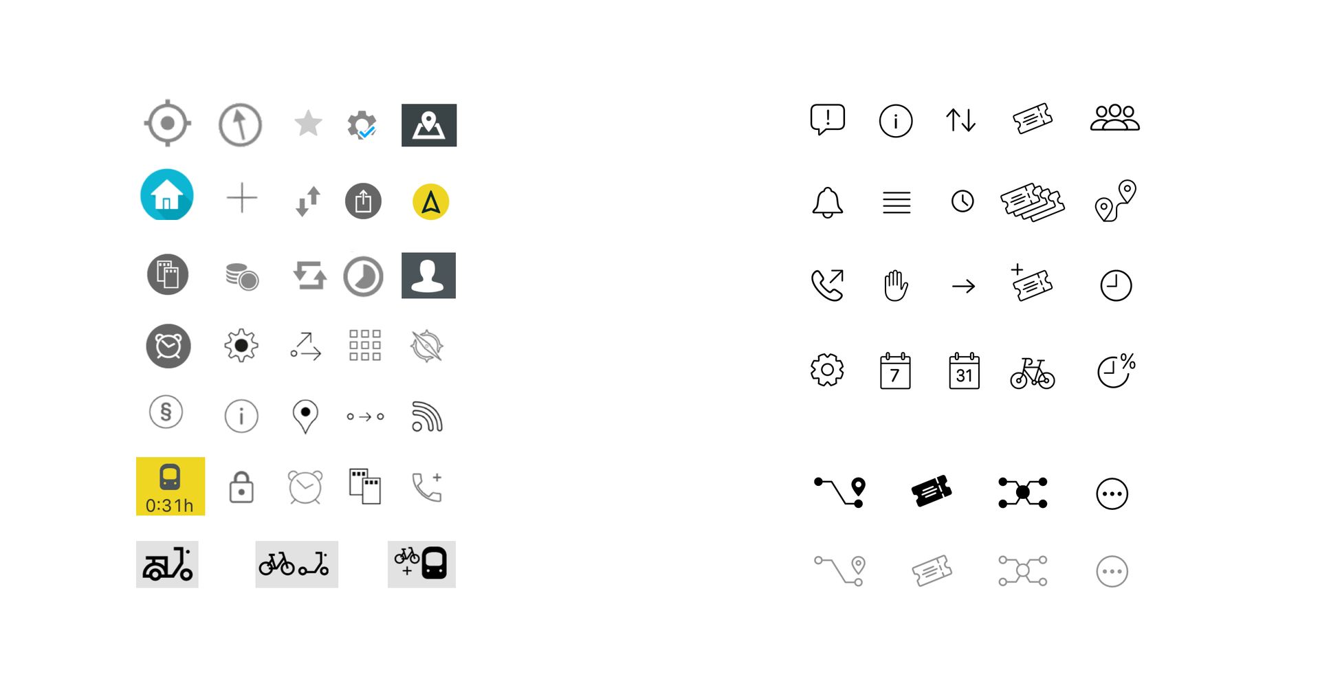
Before – Different sizes, line widths, styles, colors.
After – Uniform appearance.